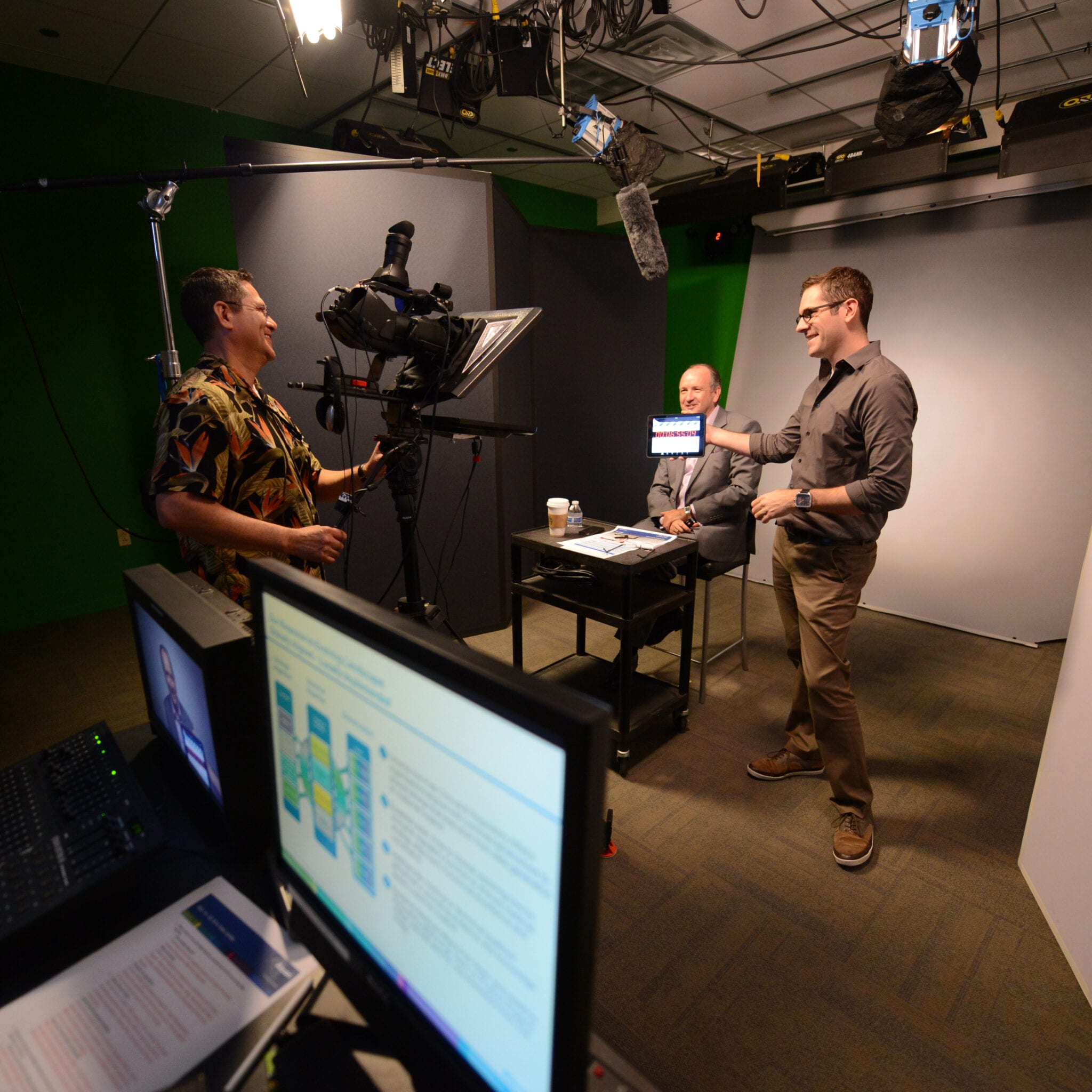
Graphic Designer
Design Bootcamp | School of Motion
Design Bootcamp was a different kind of challenge because it was less about finishing polished motion pieces and more about generating strong visual ideas from scratch, week after week. That made it one of the more demanding School of Motion classes for me, but also one of the most useful.
Each brief had a different tone, audience, and visual problem to solve, which forced me to get faster at finding the right direction instead of circling around it.


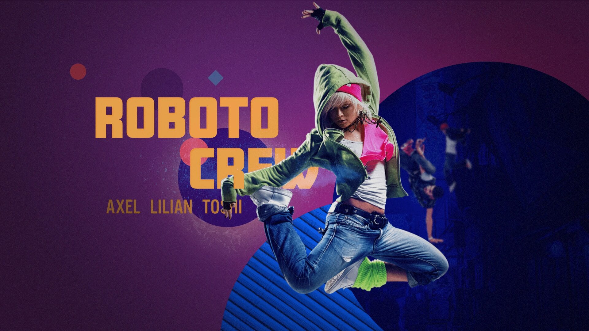
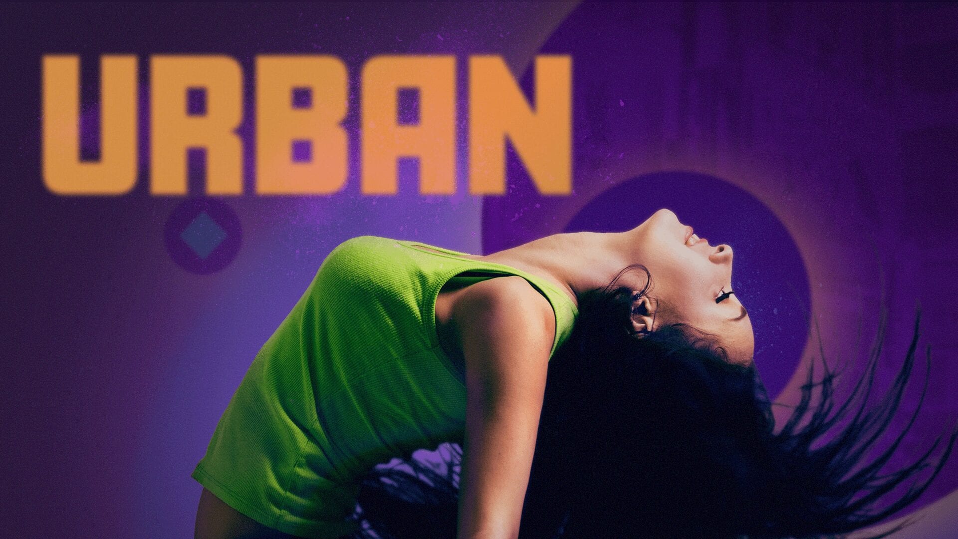
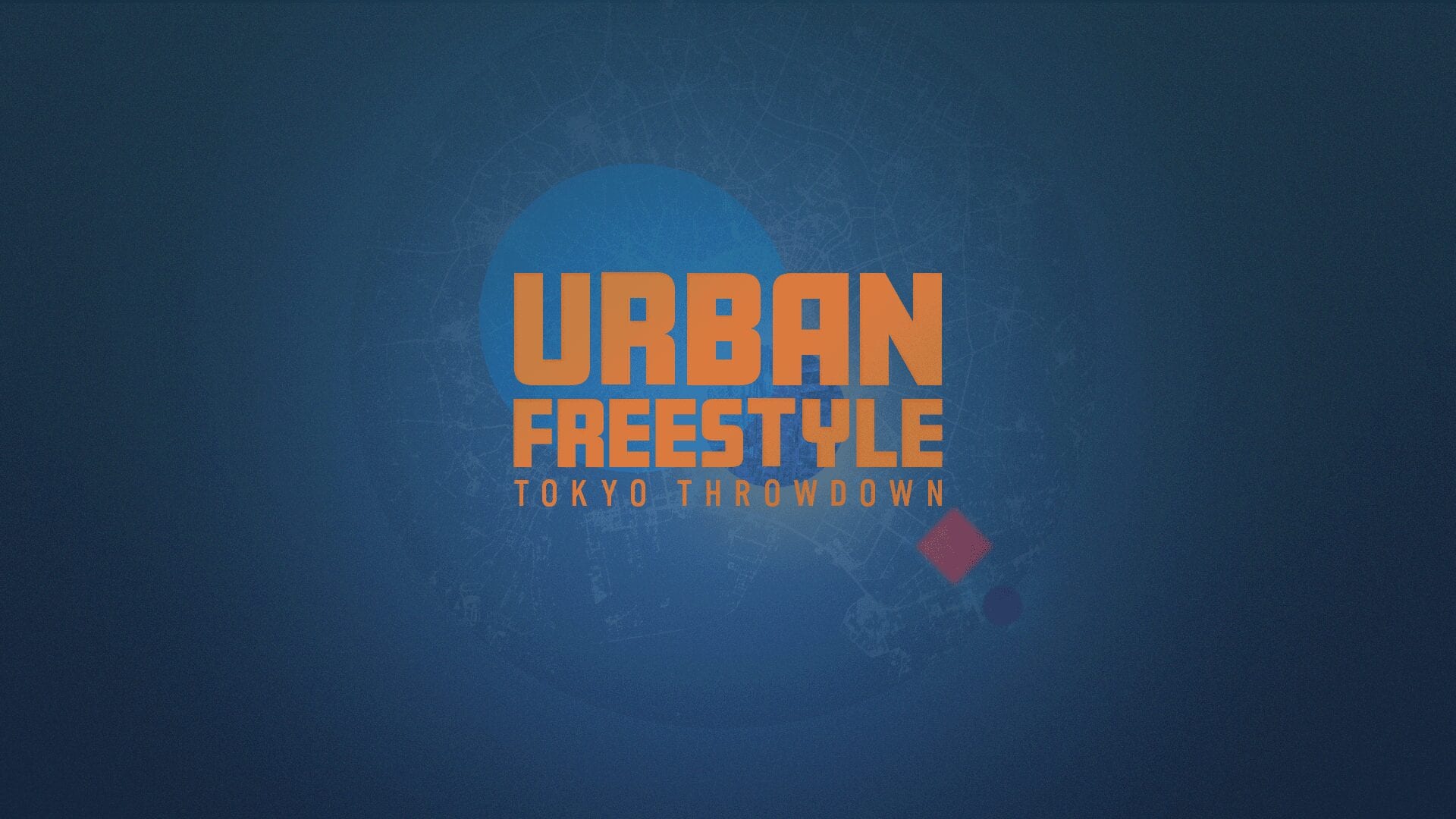

Urban Freestyle: Tokyo Throwdown
This assignment was built around a speculative Fox show about break dancers competing head to head in Tokyo. My job was designing the show open and title treatment, so the work needed to feel energetic, urban, and built for performance.
It was a homework brief, but it was still a good test of how quickly I could lock into a specific tone and make it feel broadcast-ready.
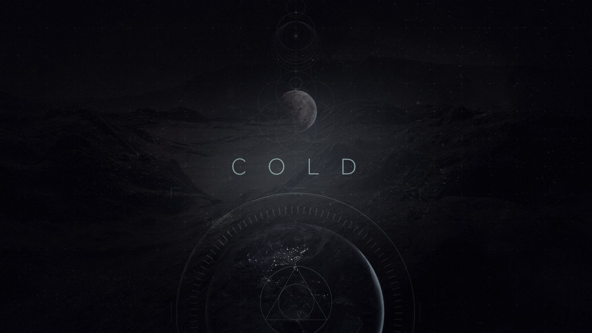
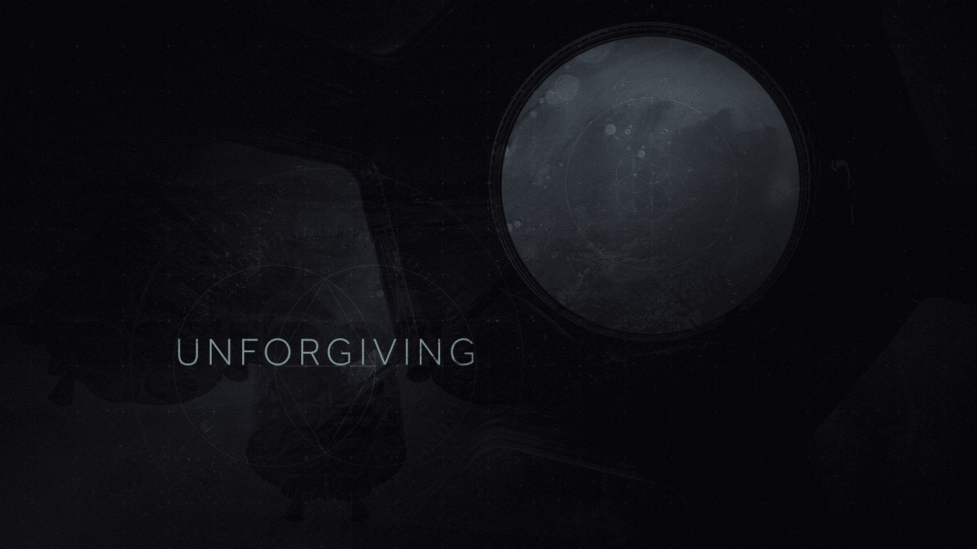
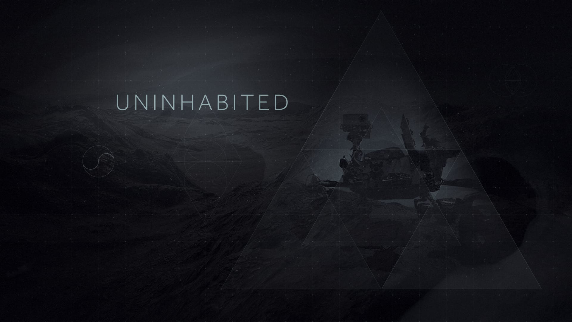
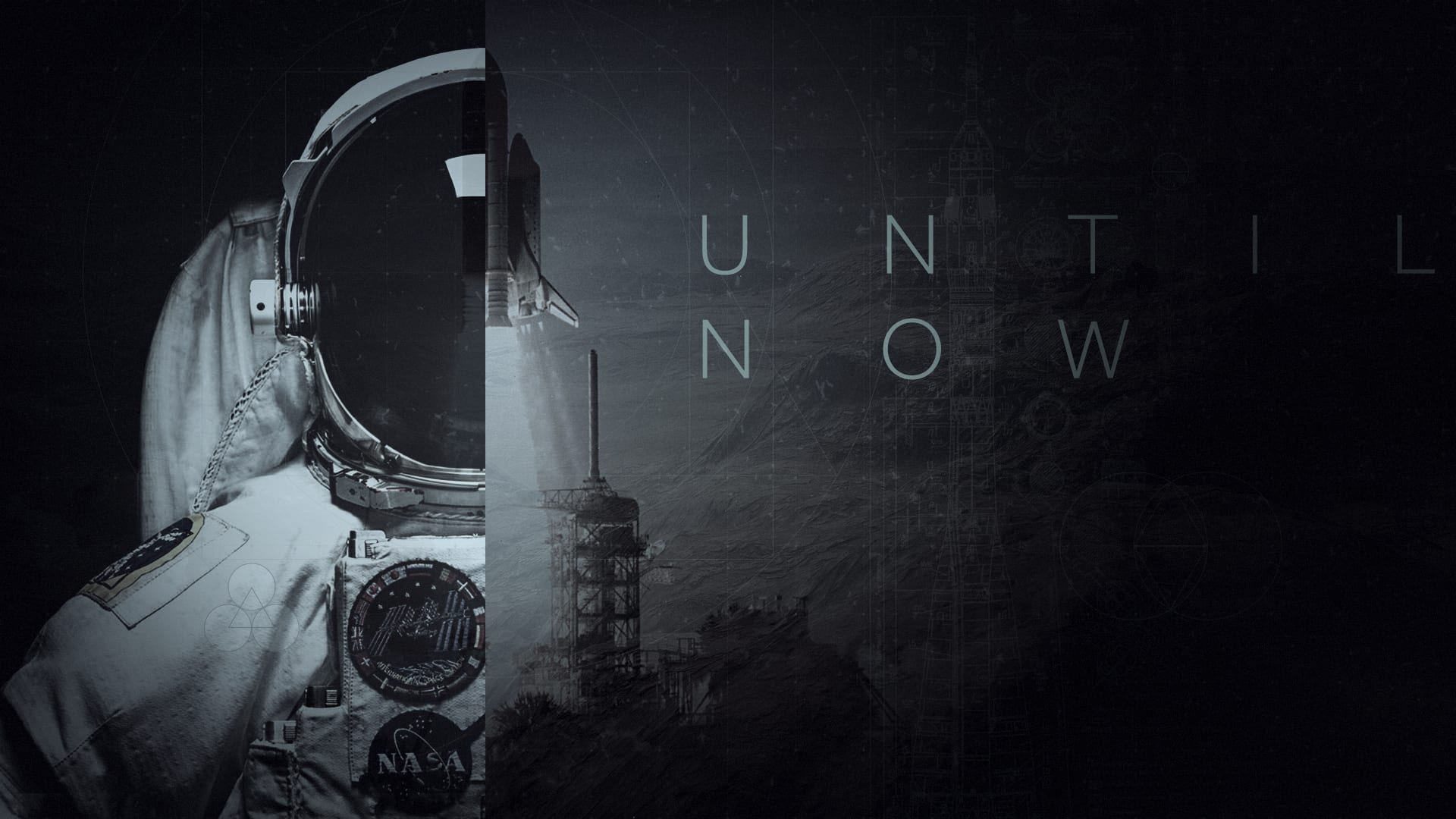
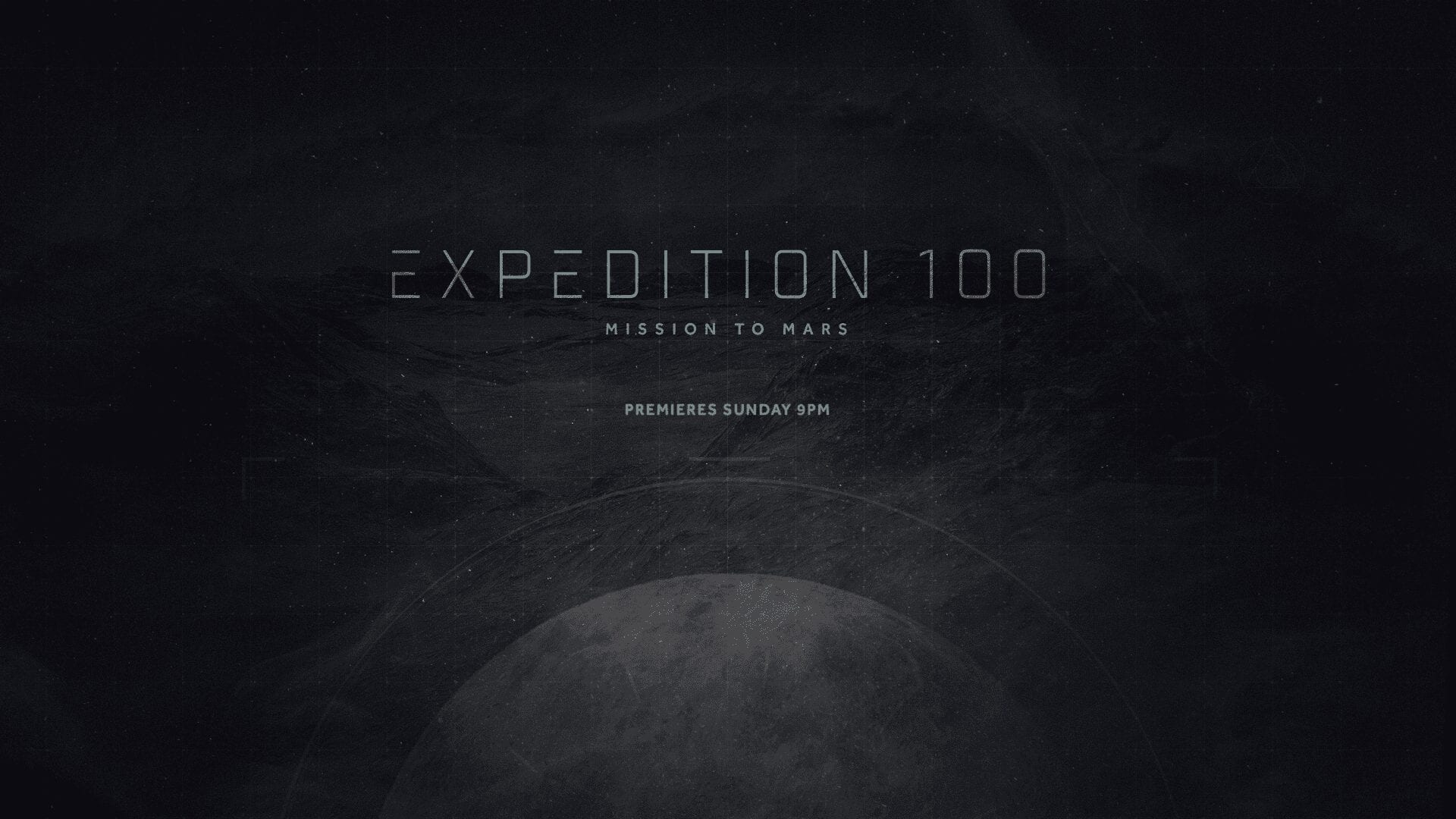
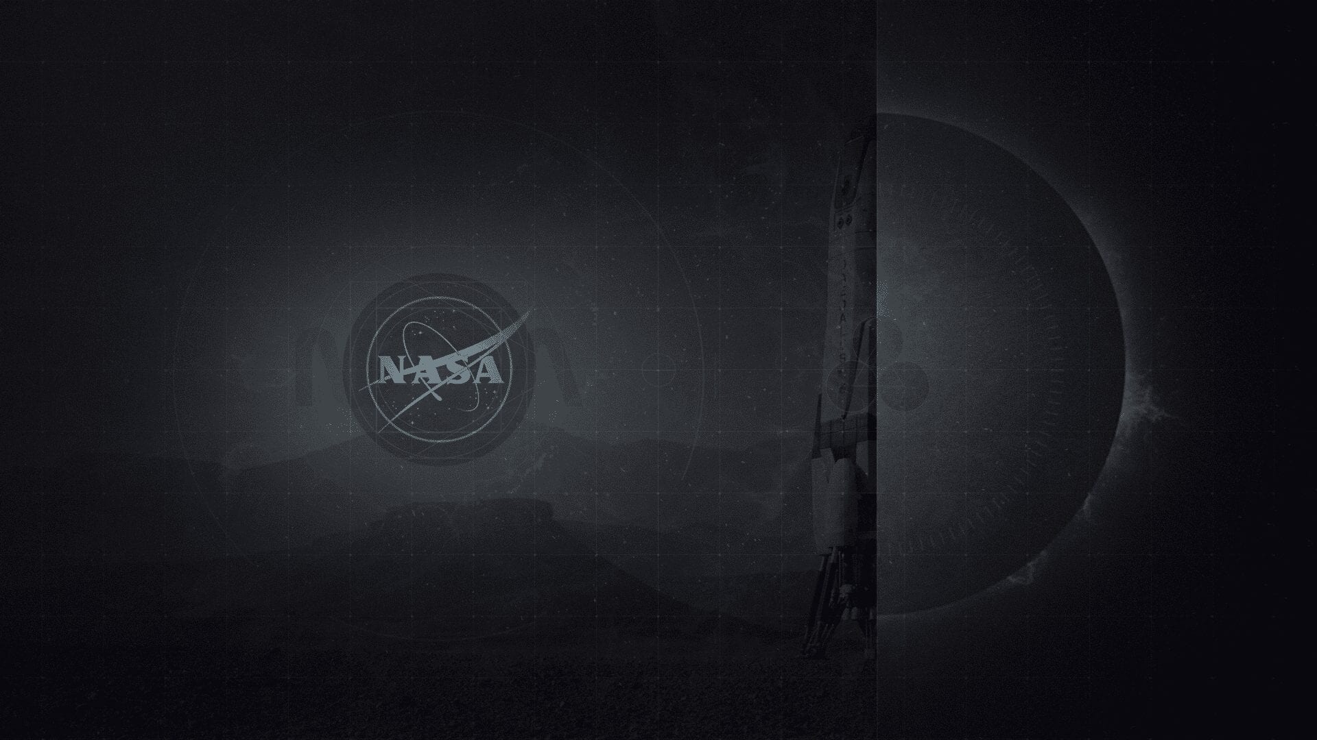
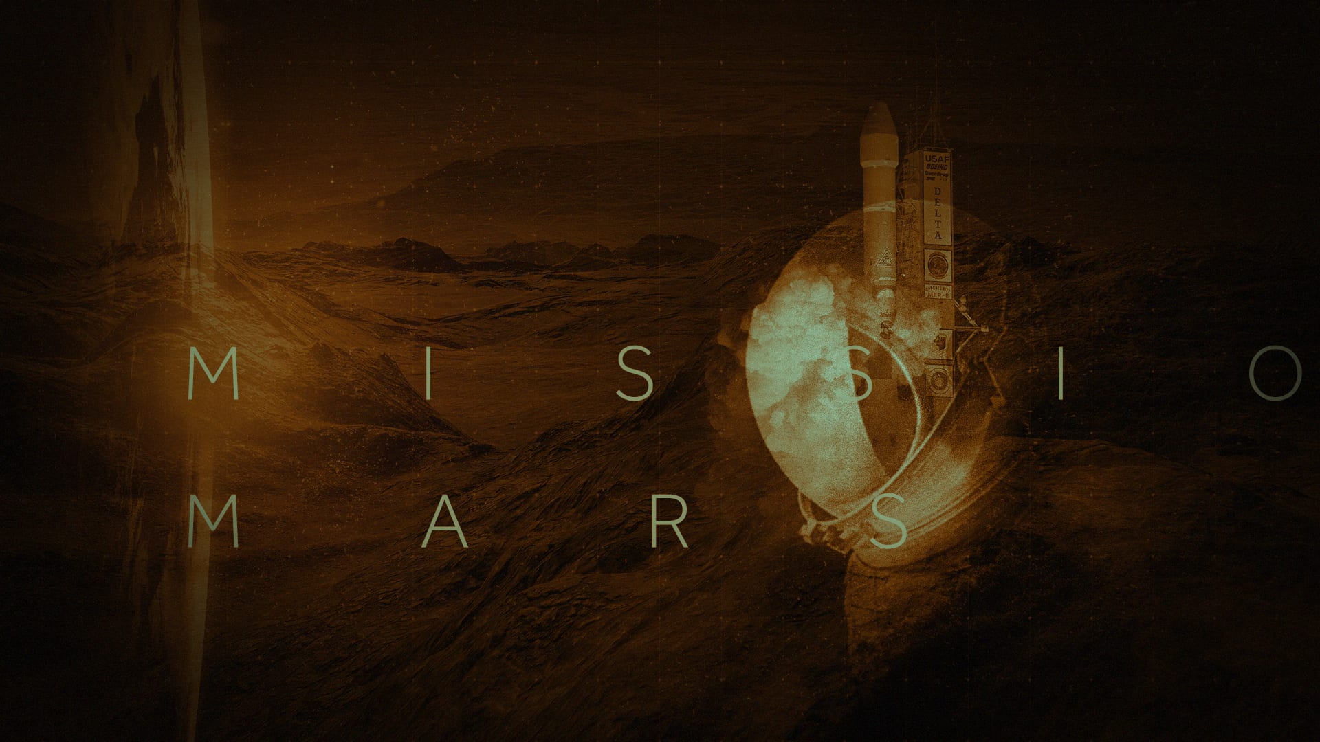
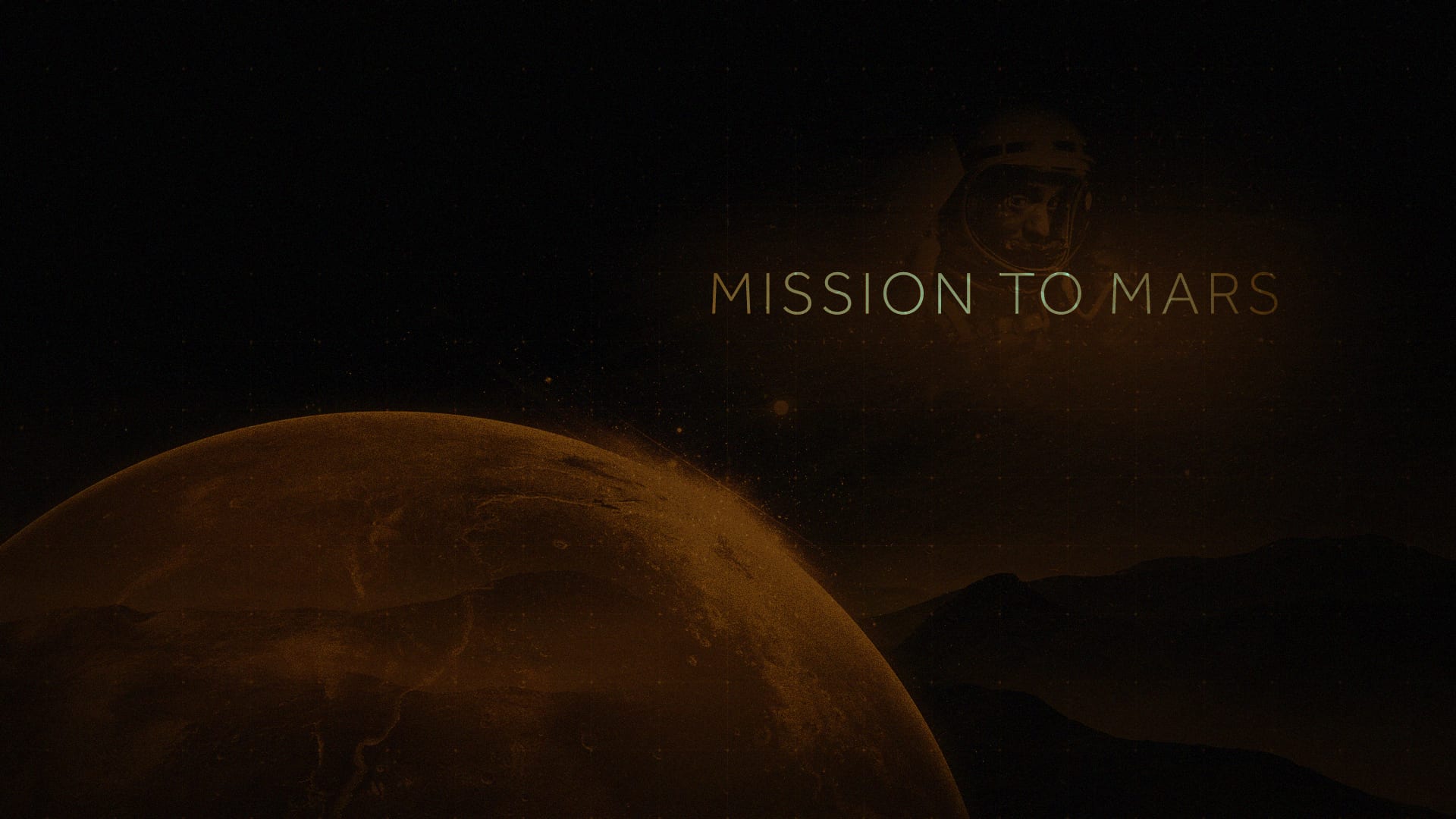
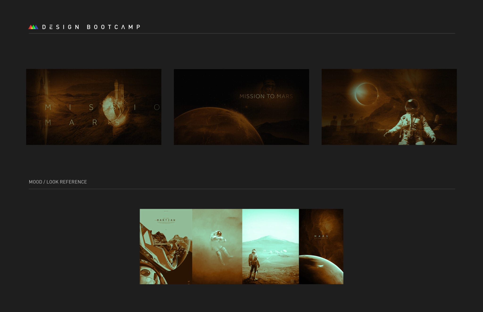
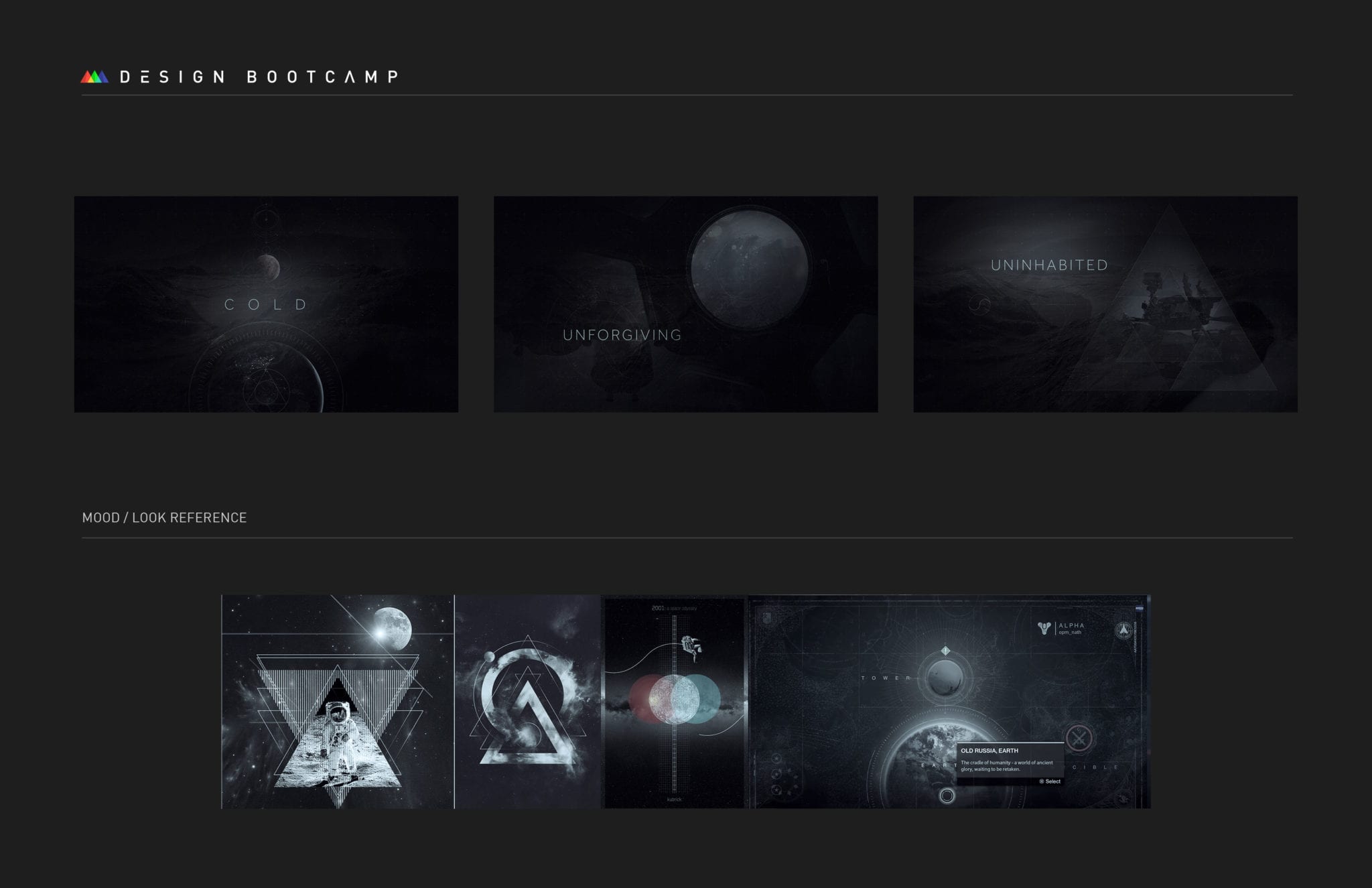
Mission to Mars
For this one, I designed title slides for a NASA TV promo built around a Mars expedition. The visual direction leaned more restrained, high-tech, and calm, which made it very different from some of the louder assignments in the class.
The challenge was keeping it sophisticated without making it feel cold.


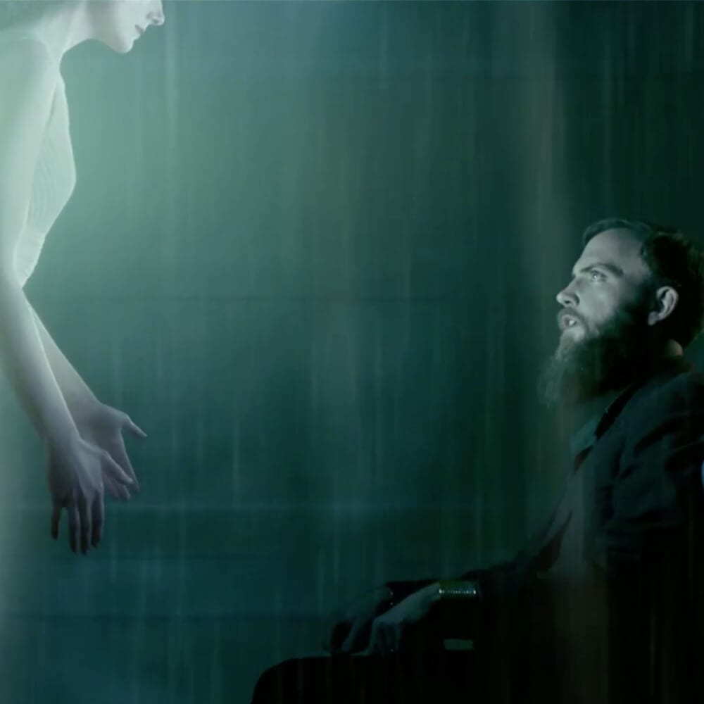
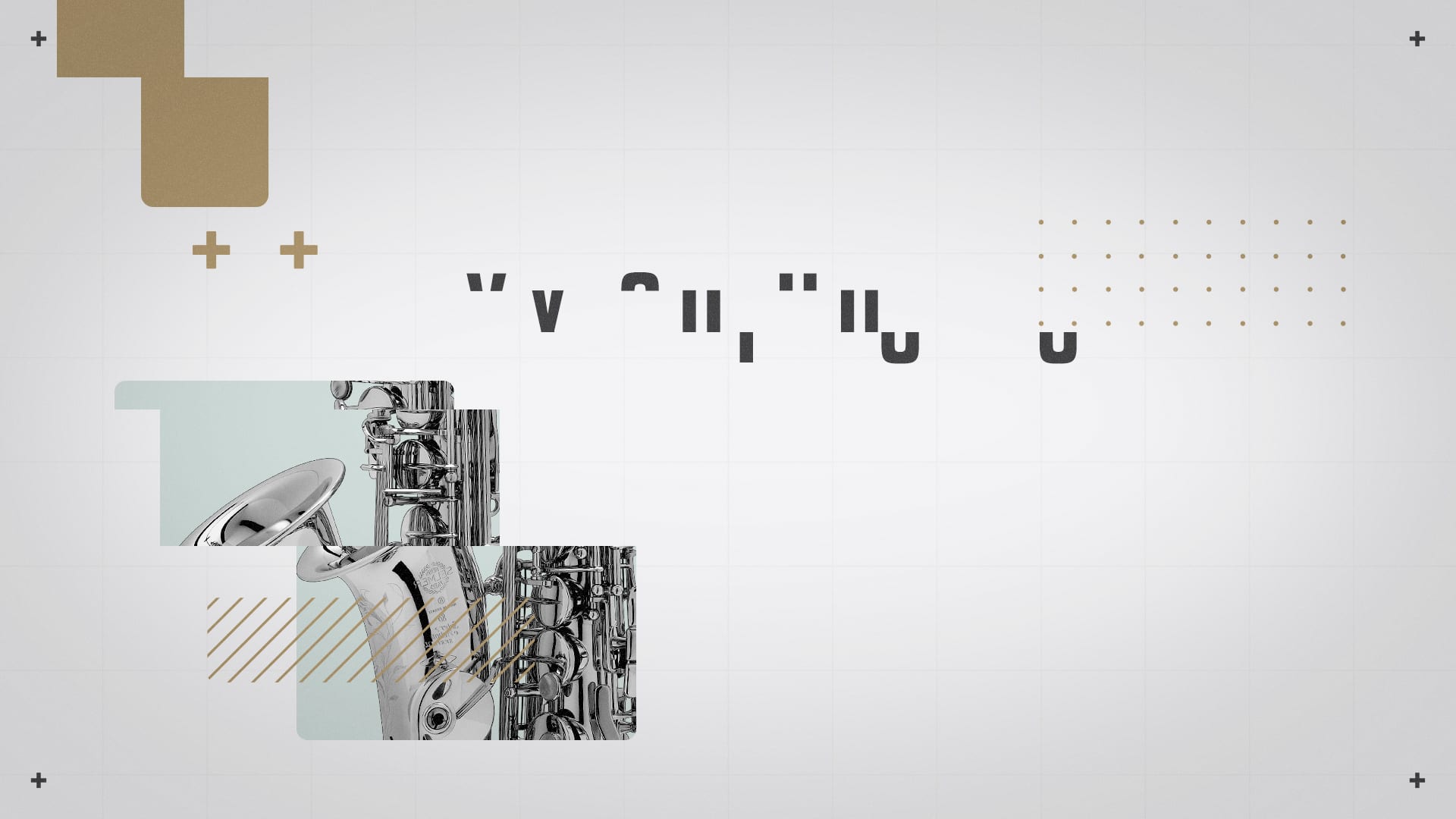
12 Kilometers
This project was for the trailer of Mike Pecci's horror film, so the job was creating title frames that could support that mood right away. I designed the opening title card, end card, and the transitions that tied them together.
Because the film had already been accepted into the Boston International Film Festival, the piece needed to feel specific and cinematic, not just like a class exercise.
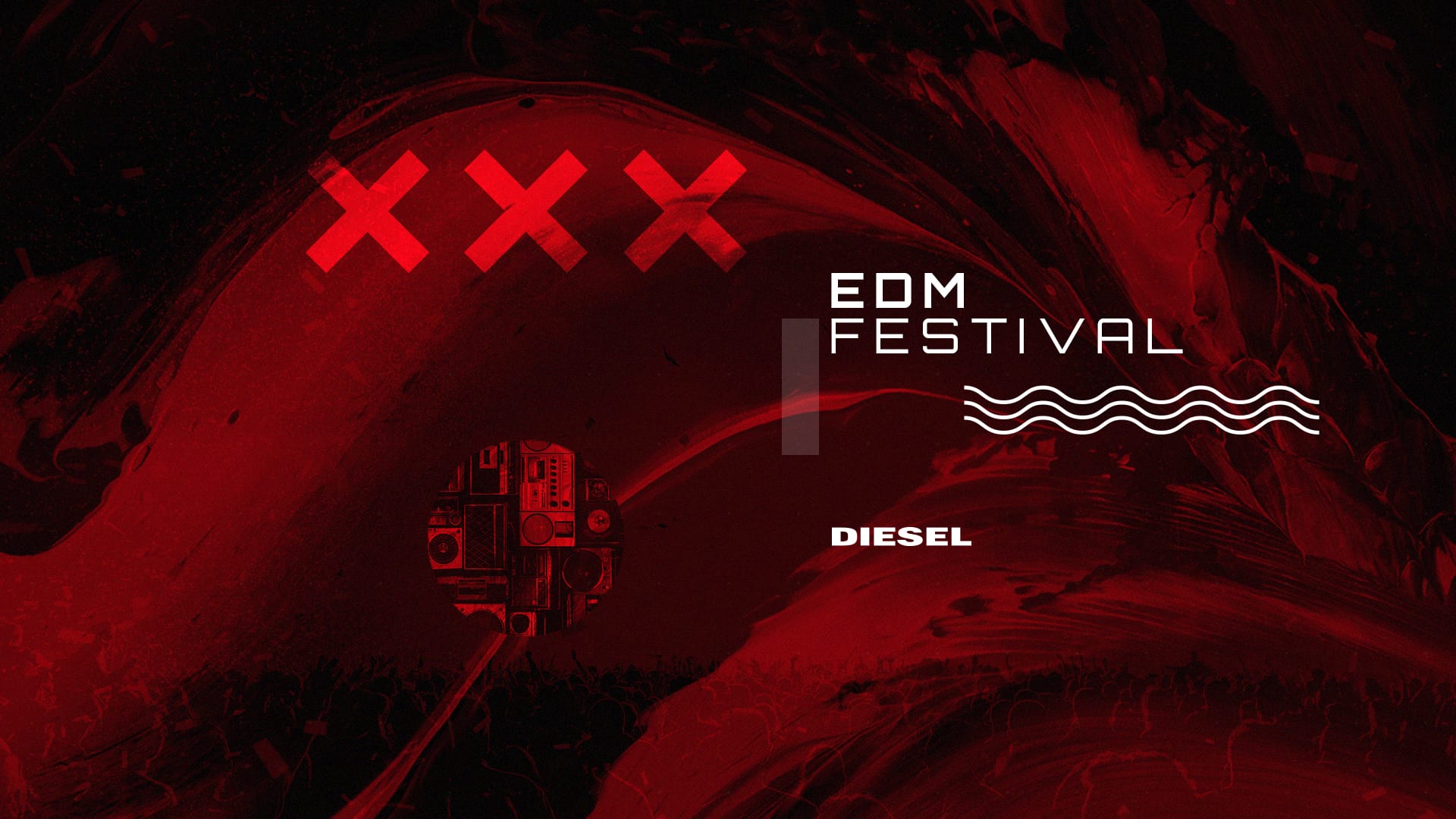
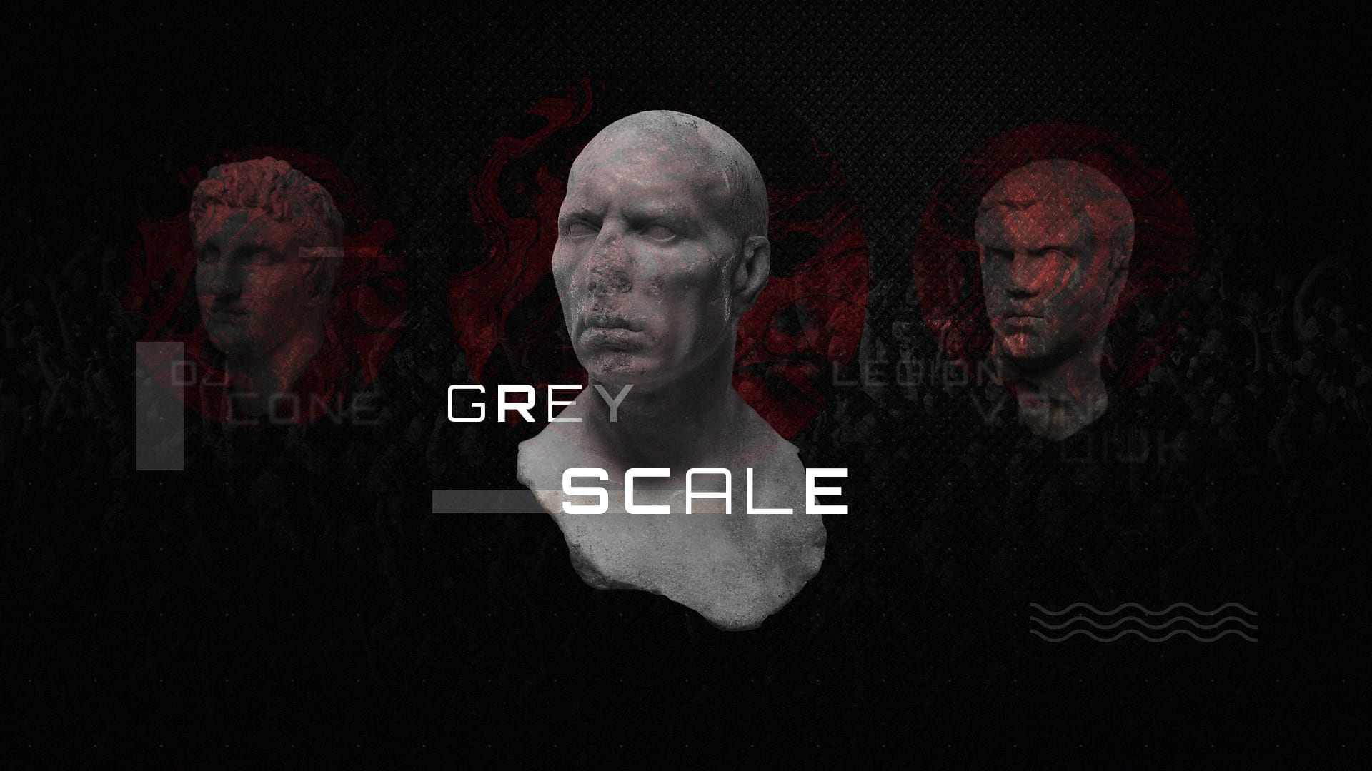
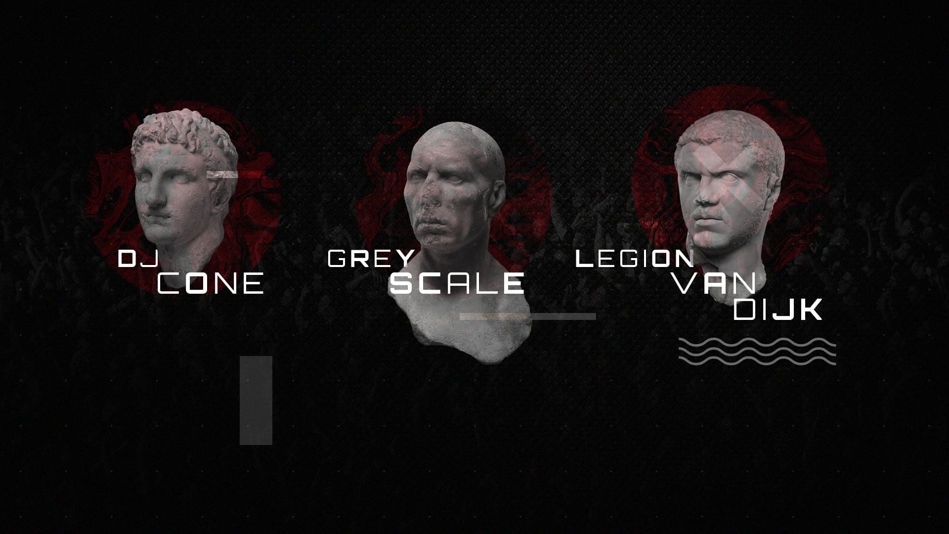
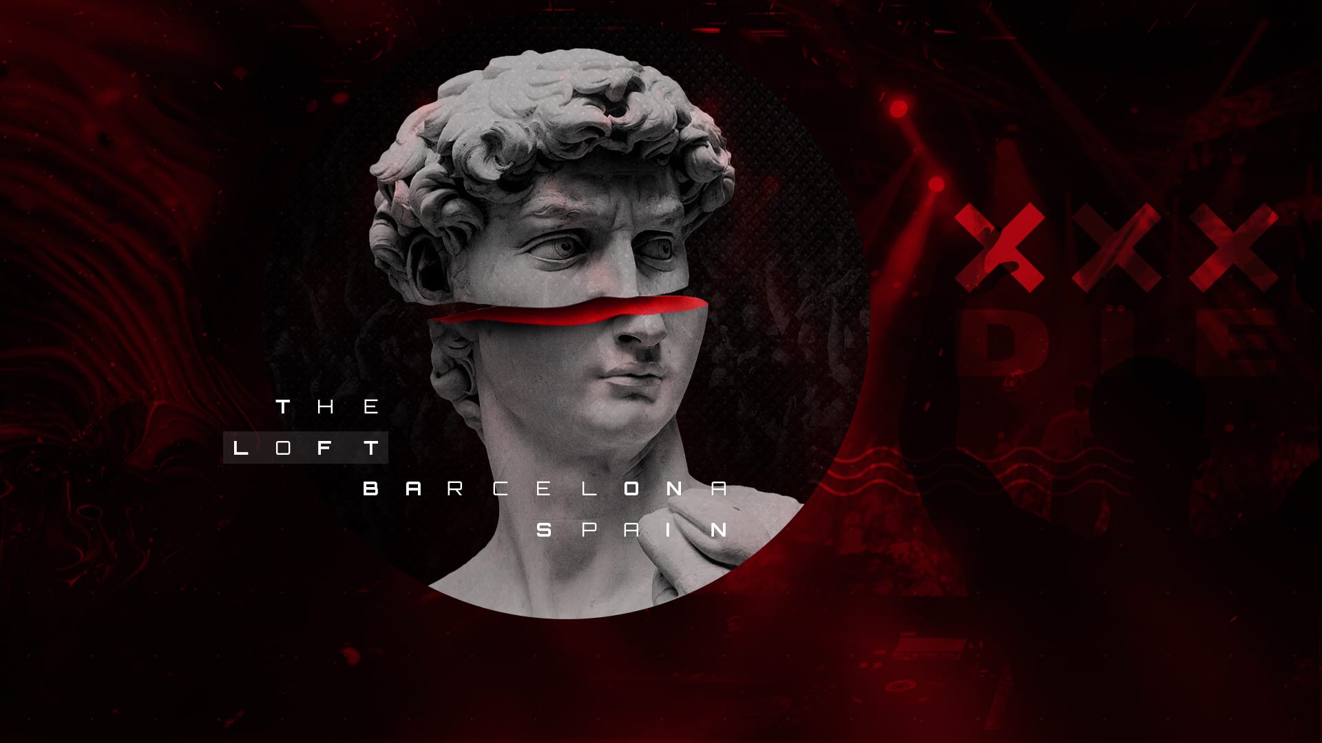
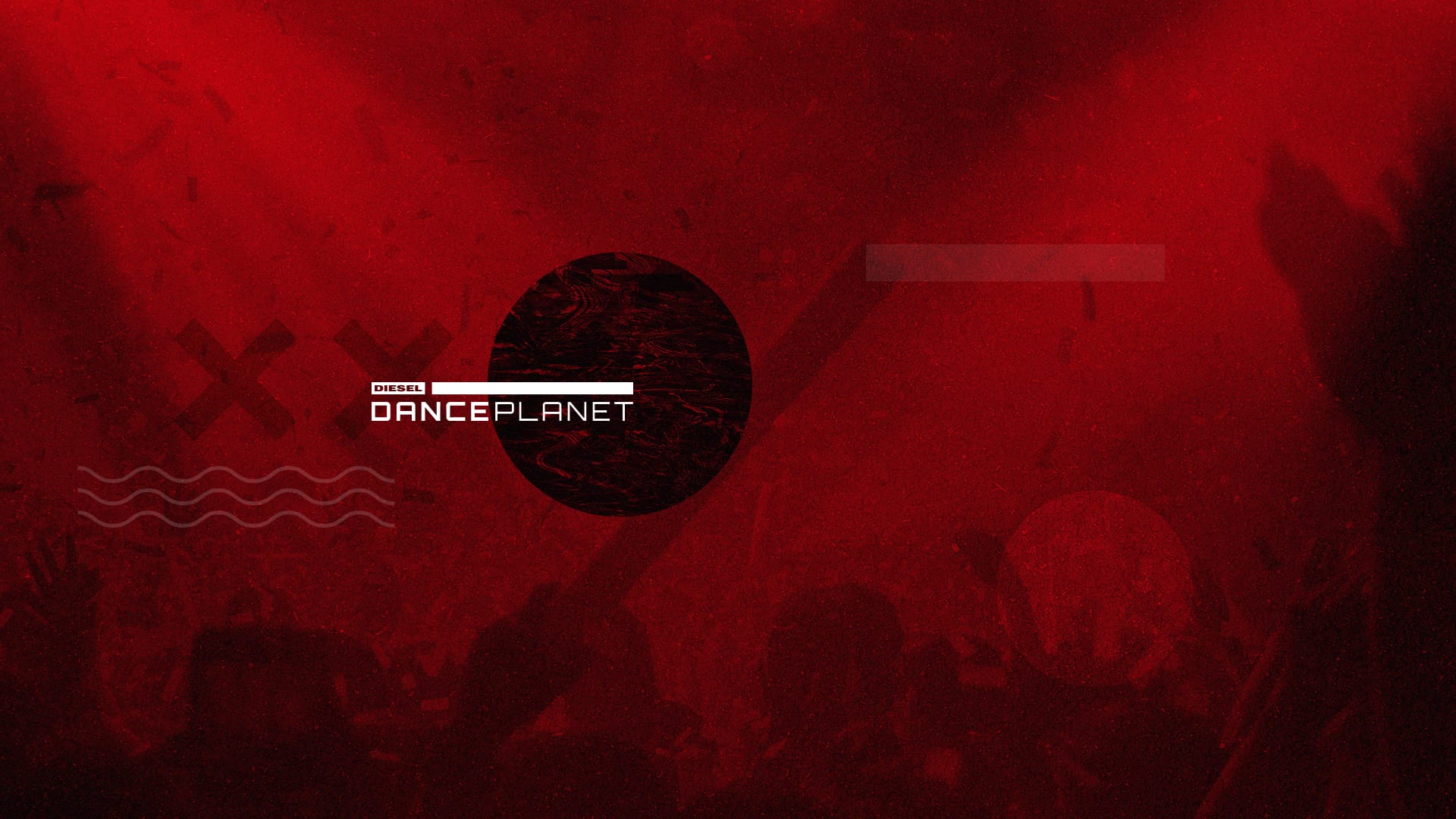
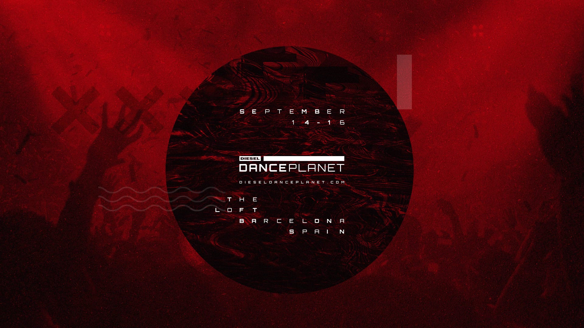
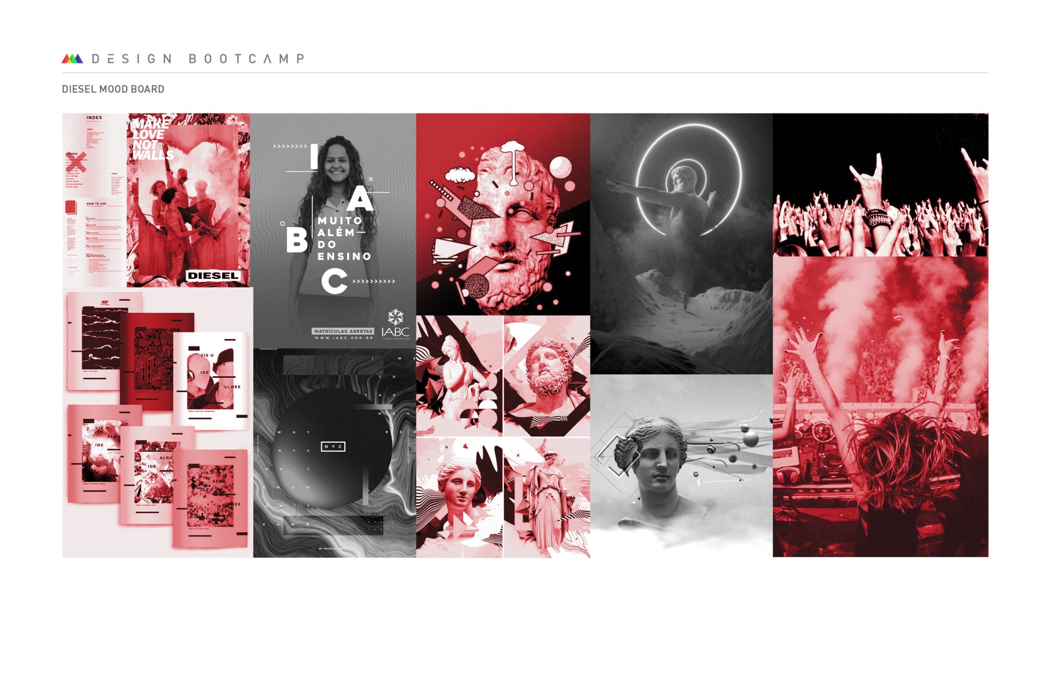
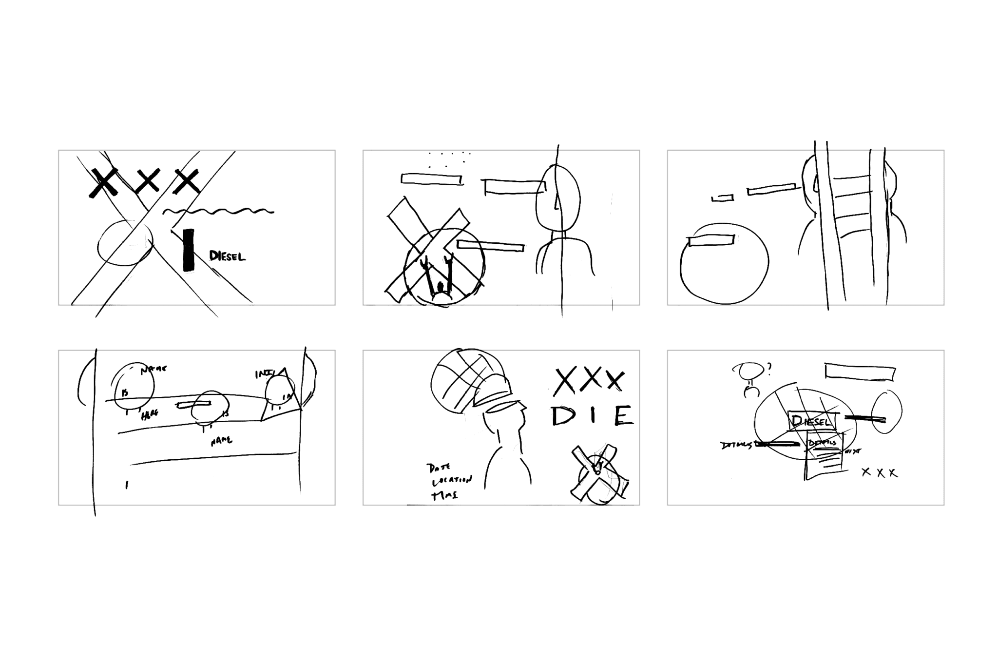
EDM Festival in Barcelona hosted by Diesel
This was a 30-second commercial concept for a Diesel-hosted EDM festival in Barcelona. The design had to carry the energy of a festival, but still feel like it belonged to the Diesel brand.
That balance was the whole assignment. Loud enough to feel alive, but still controlled enough to feel designed.


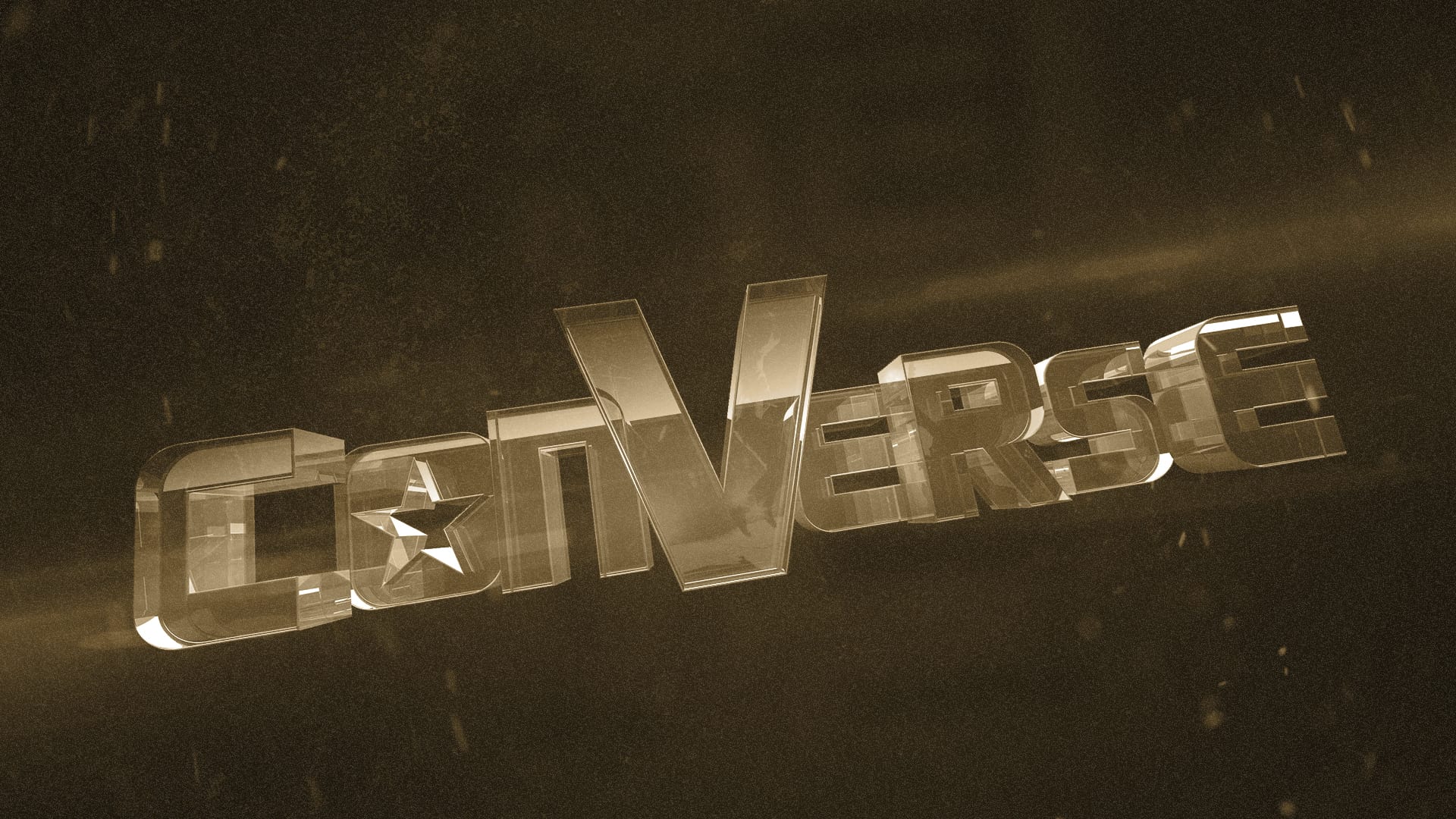
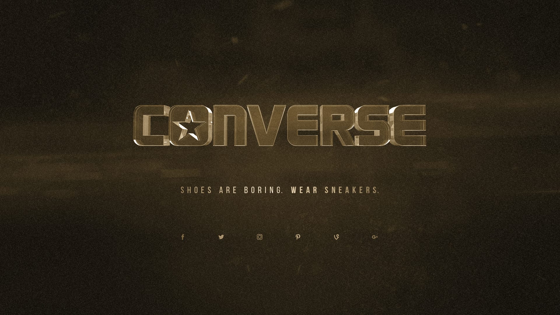
Converse logo reveal
For Converse, I designed a short five-second logo reveal built for online video. The piece needed to feel authentic to the brand and land quickly without looking generic.
That kind of short-form branding work is always a good pressure test because there is no room for wasted motion.


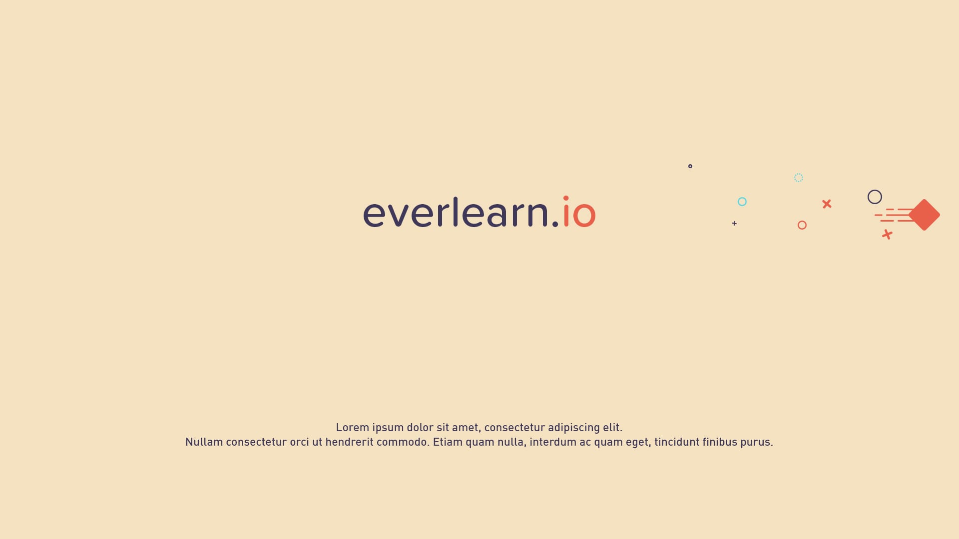
Everlearn.io
This assignment was a 15-second commercial for an education startup built around the idea of a new model for learning. I created the boards and visual direction for the spot.
The goal was making the concept feel clear and modern without drifting into startup cliché.

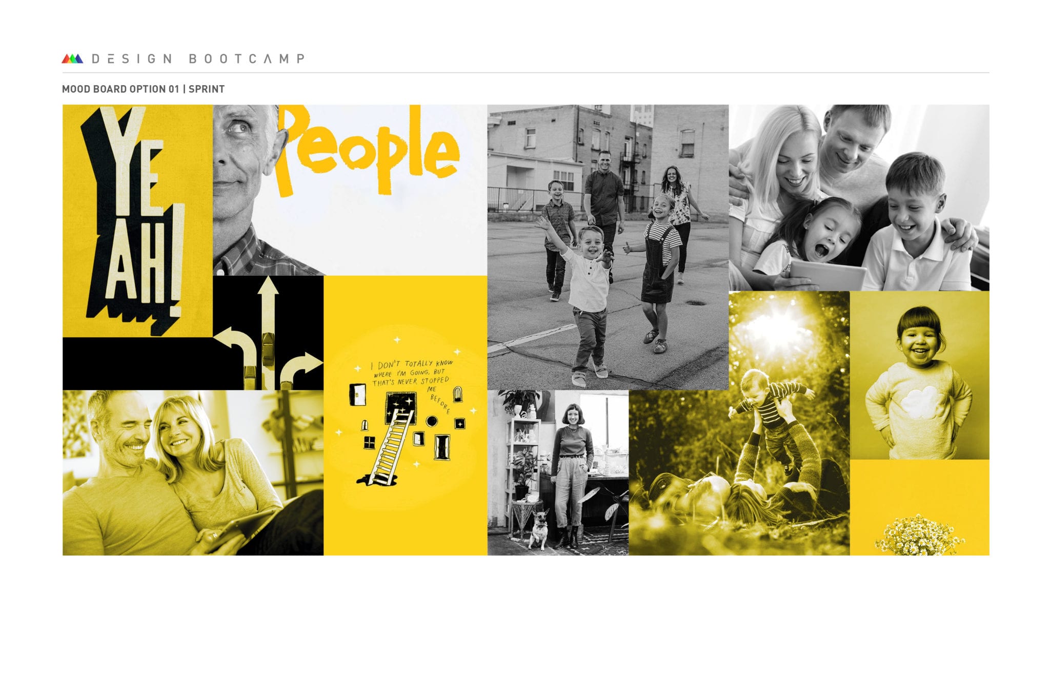
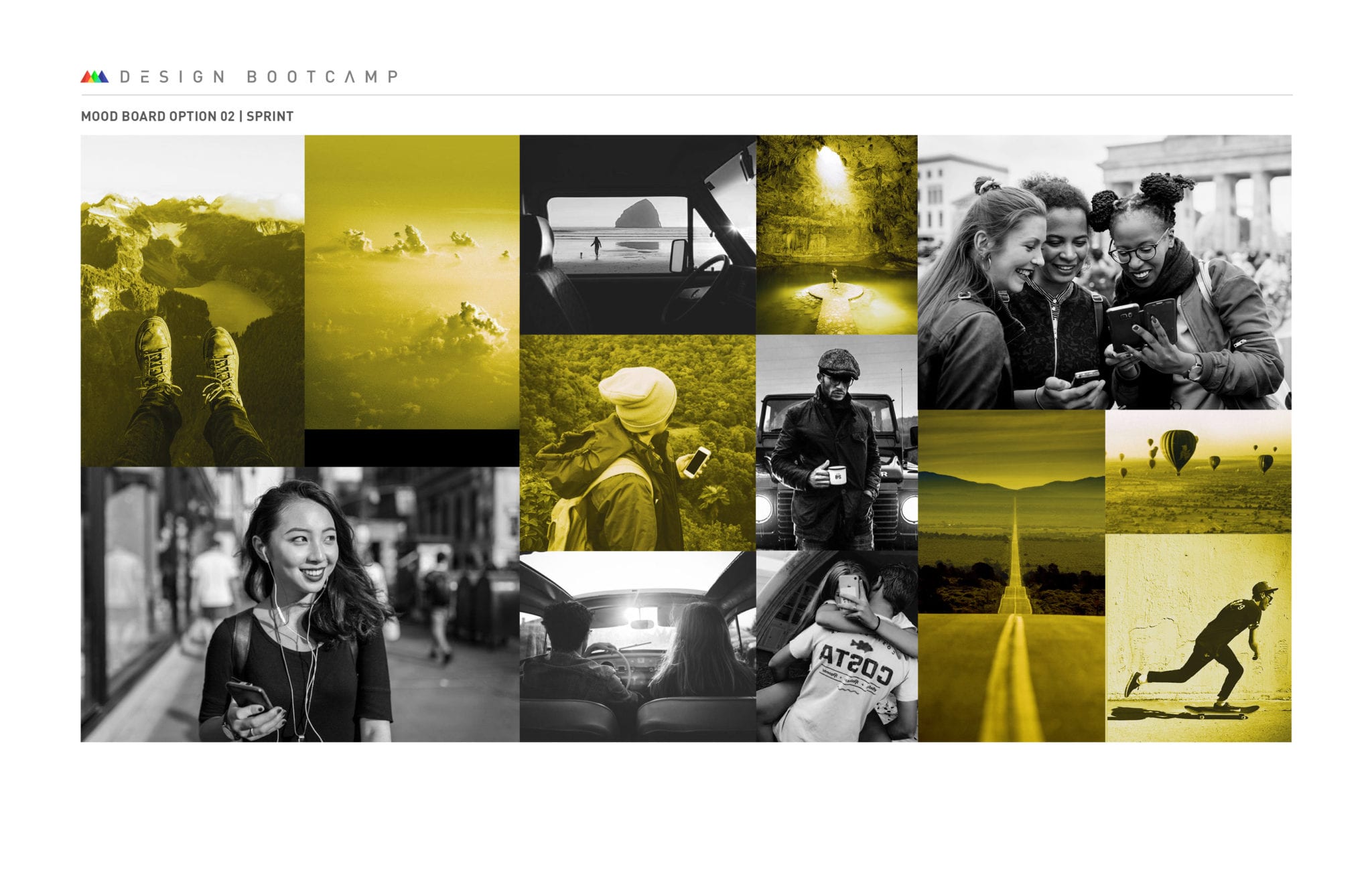
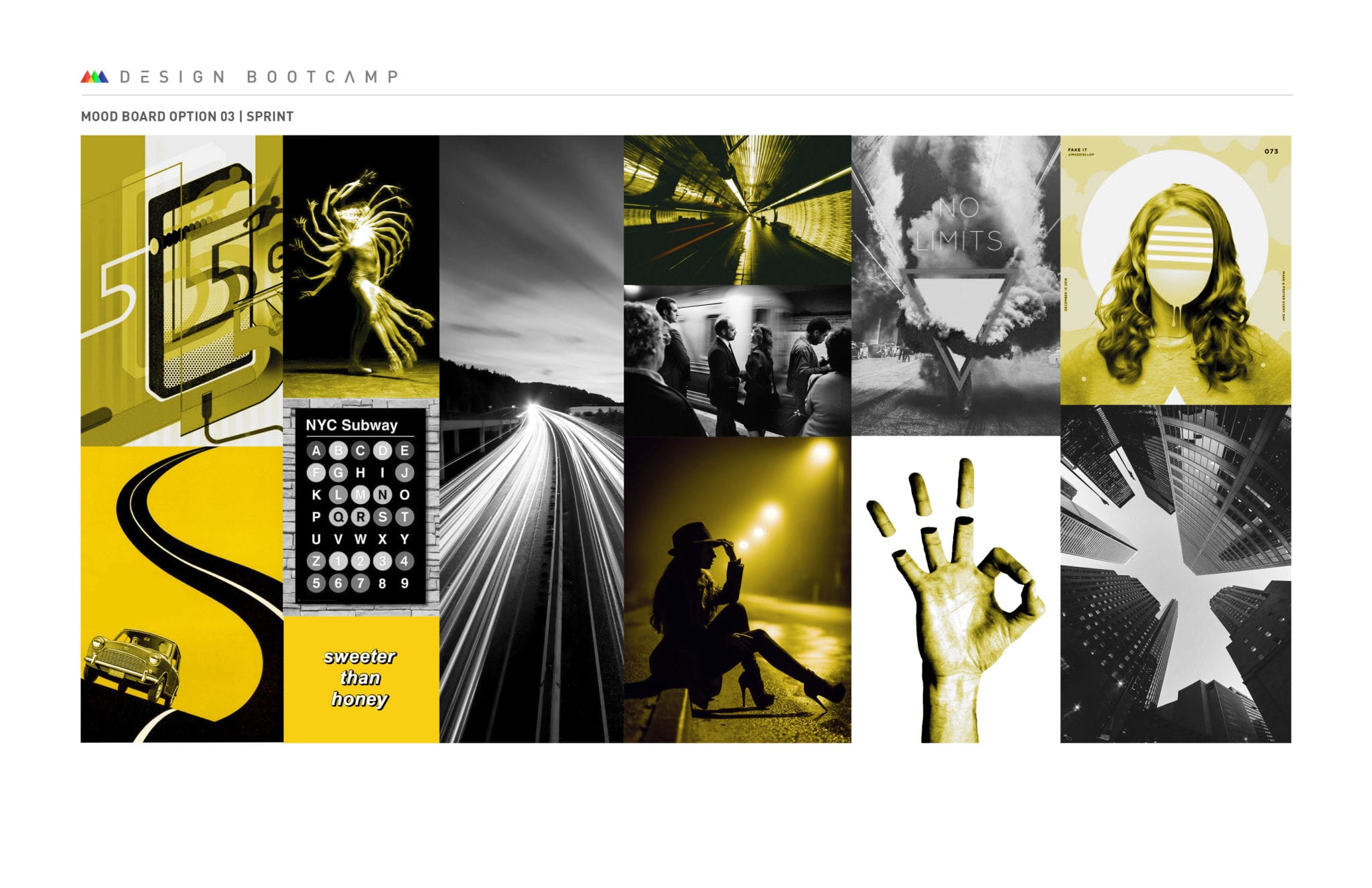
'Unlimited Data' plans with Sprint
For Sprint, I developed mood boards and offer-page concepts for a campaign around Unlimited Data. The work needed to leave room for customization while still feeling anchored to the brand.
That made it more of a system design problem than a single-frame problem, which was part of what made it useful.


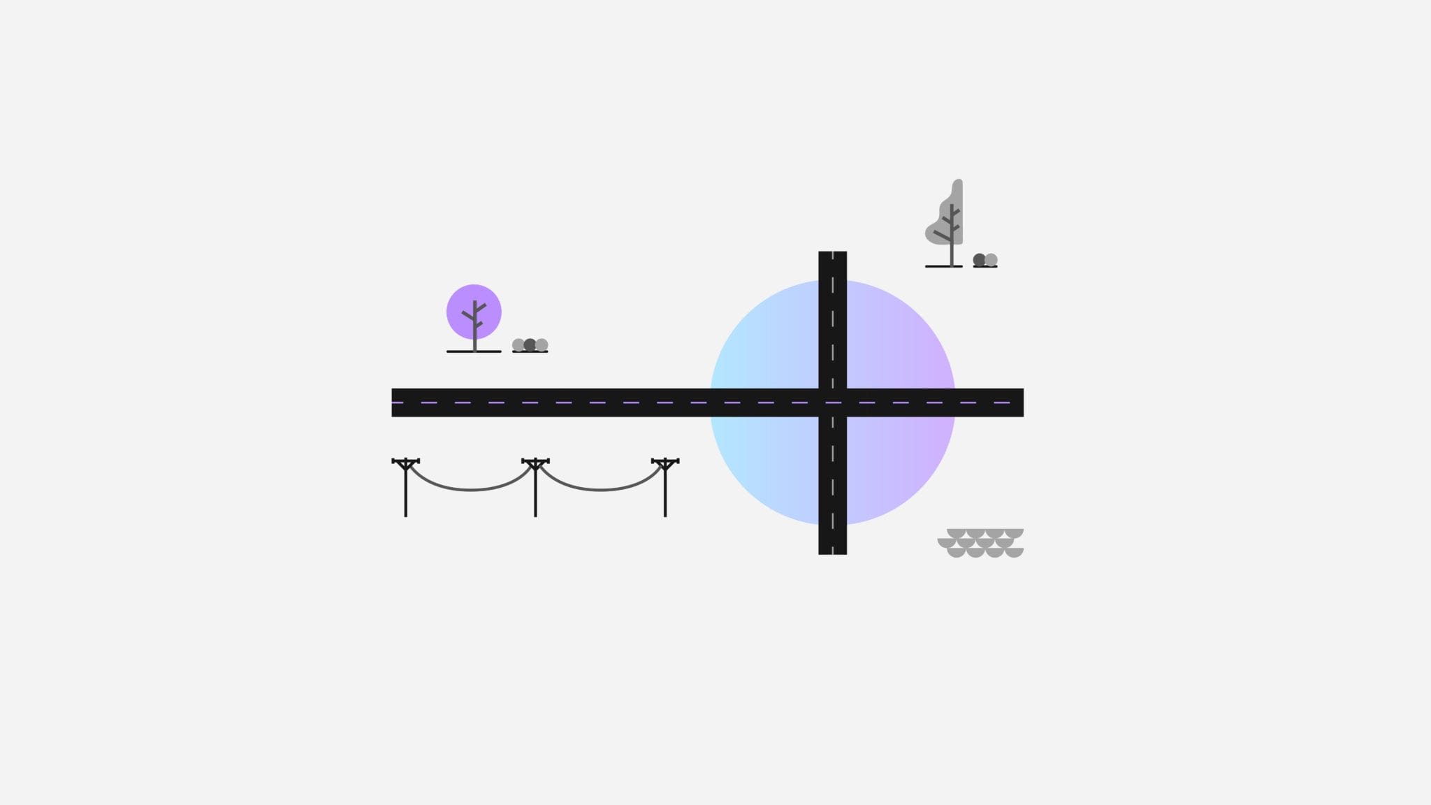
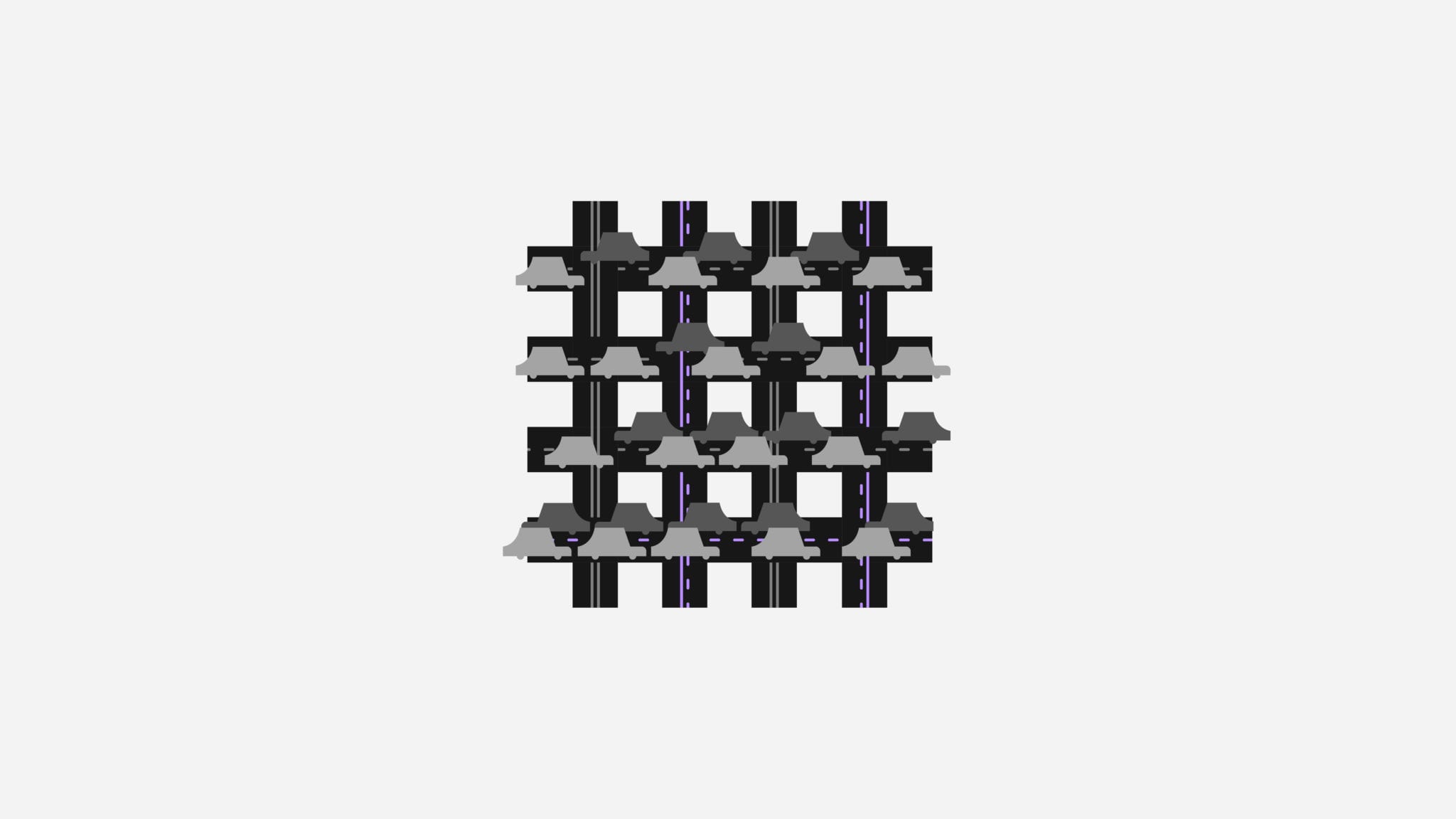

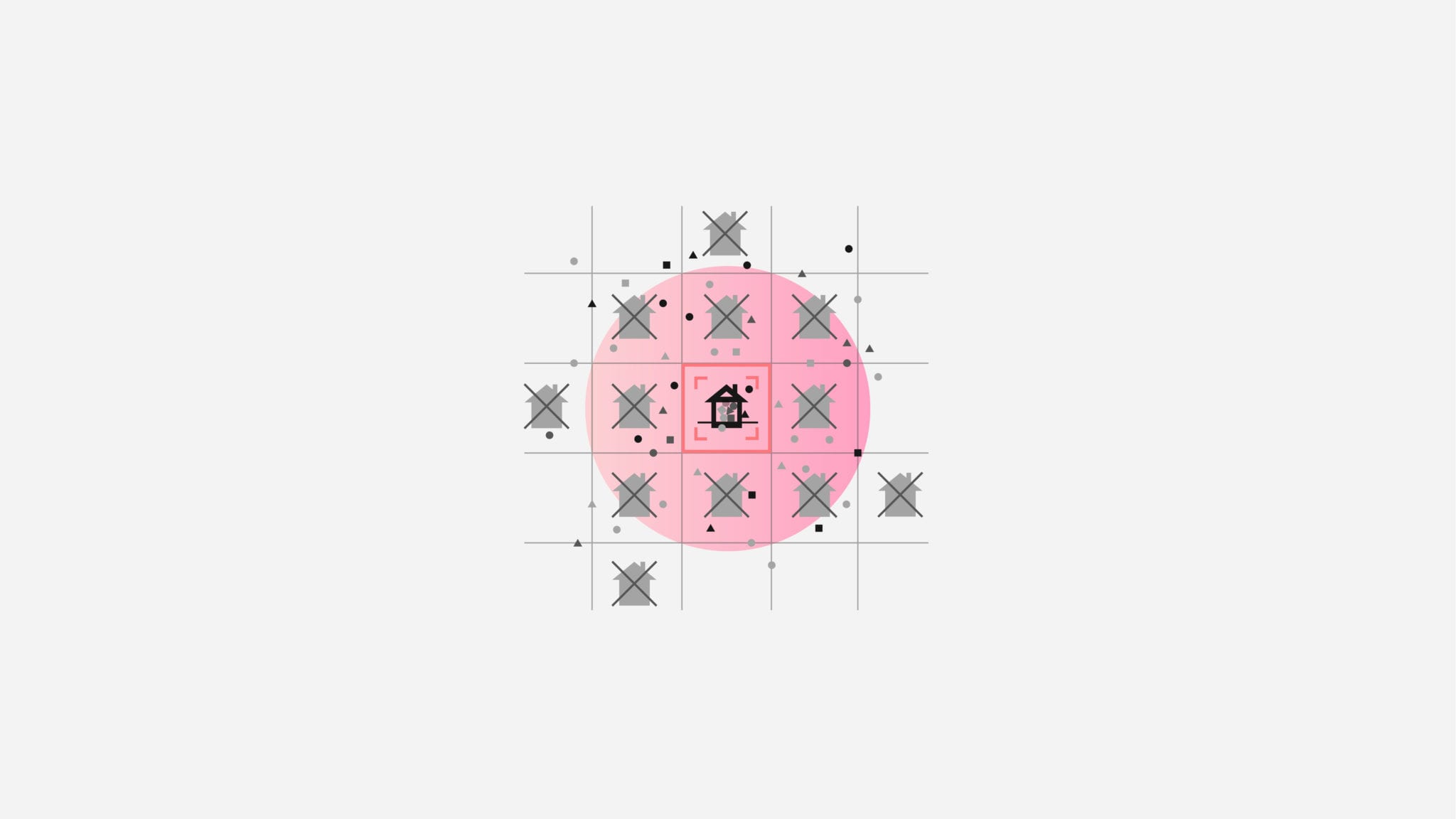
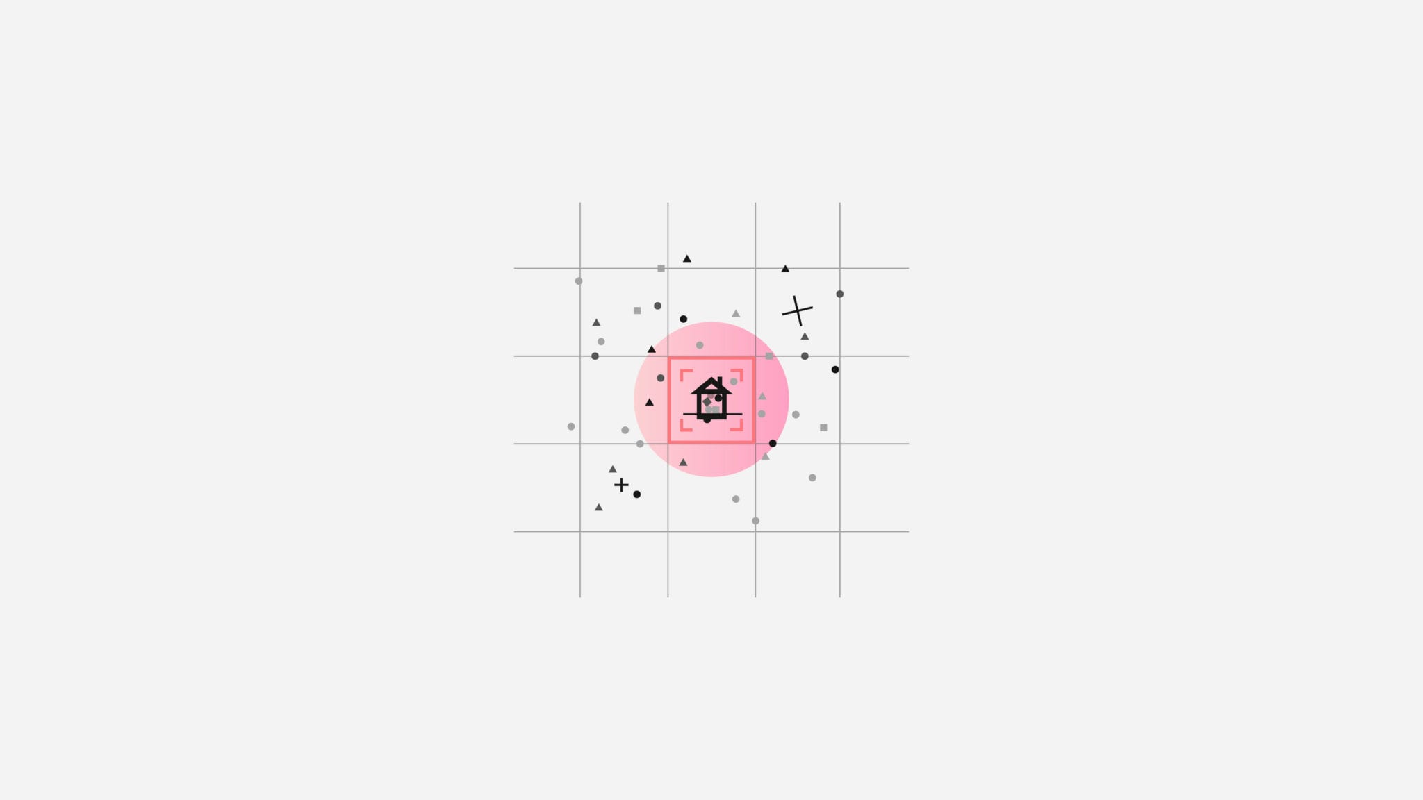


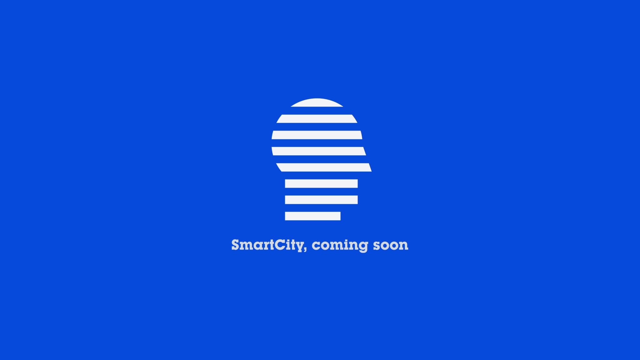
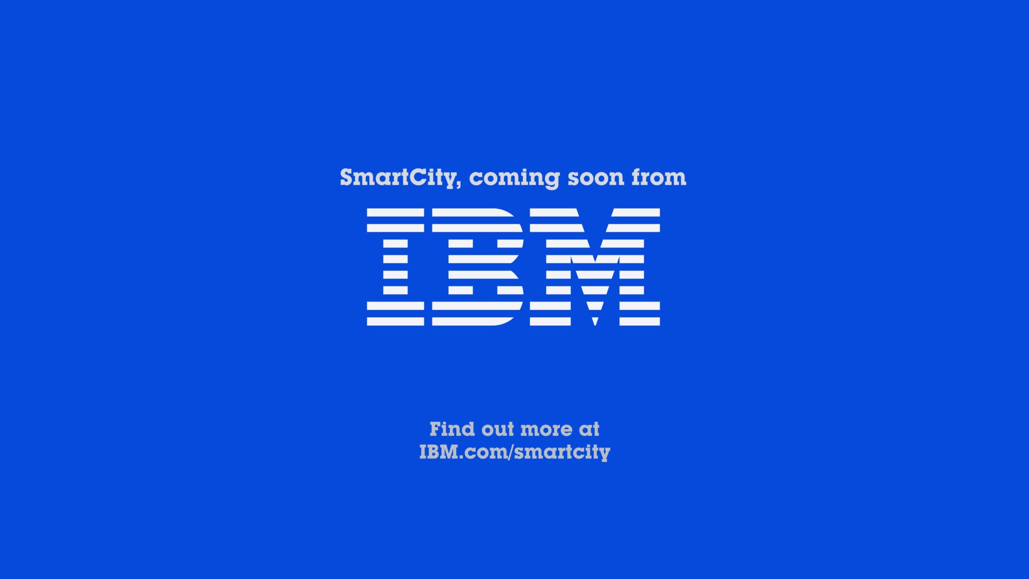
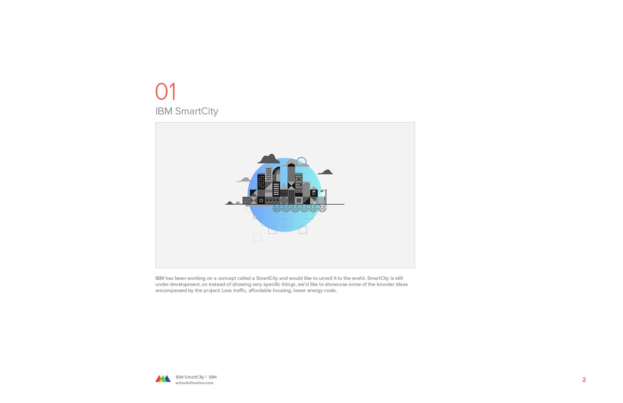
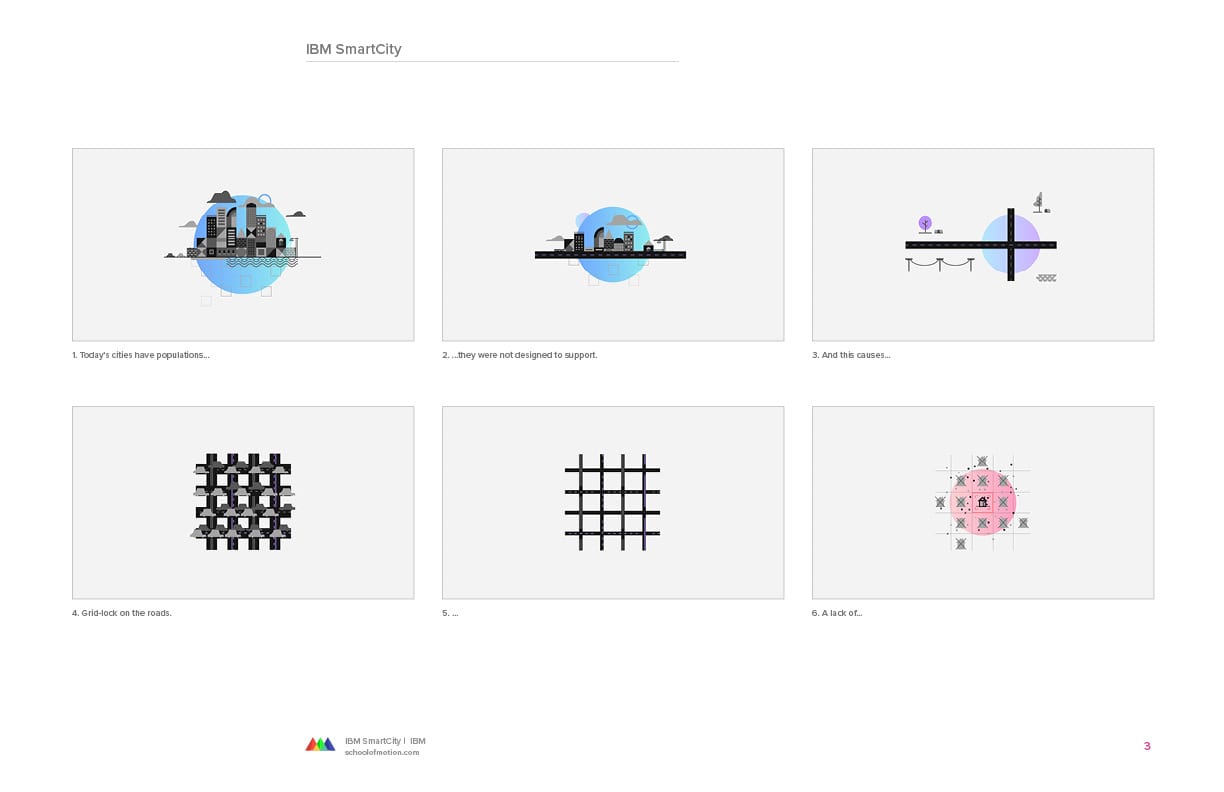
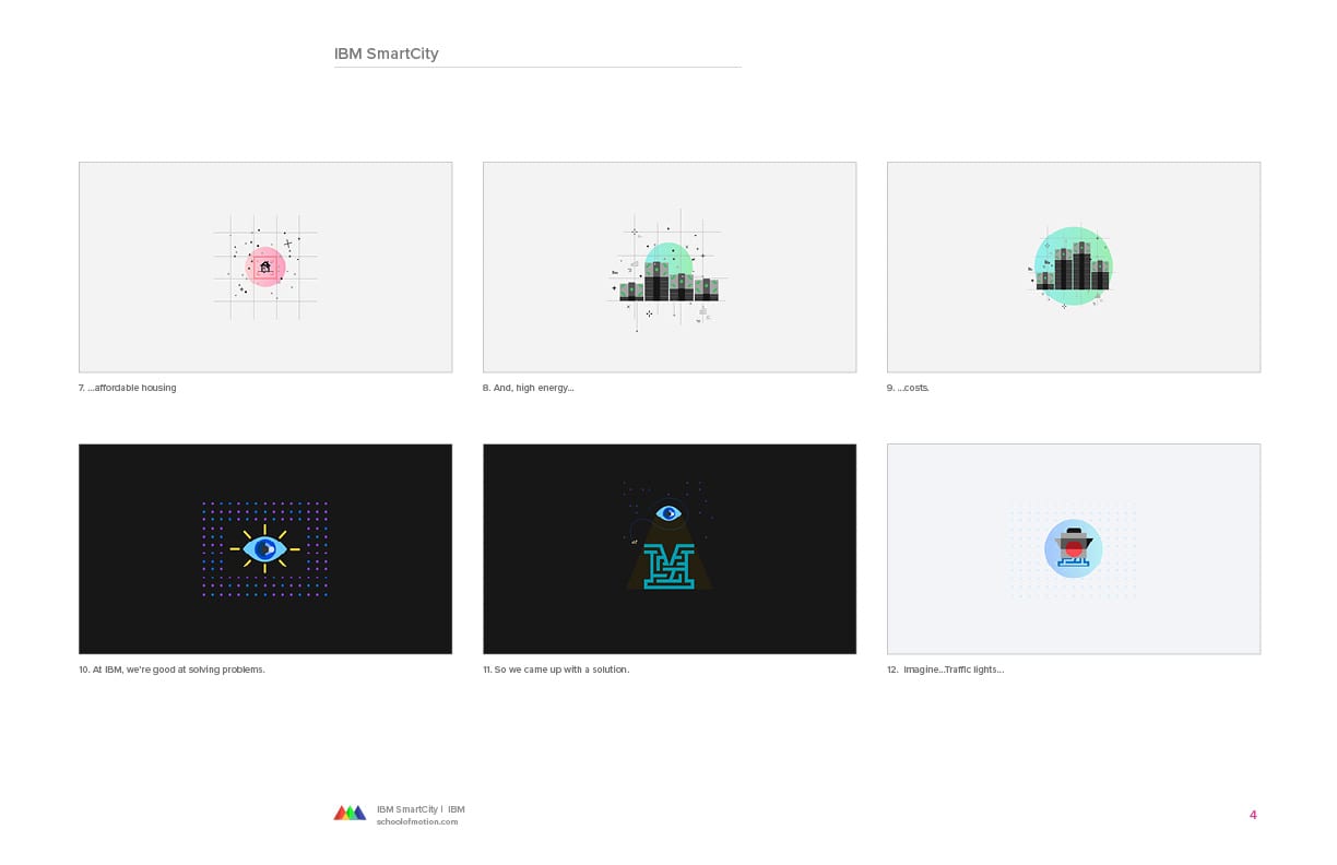
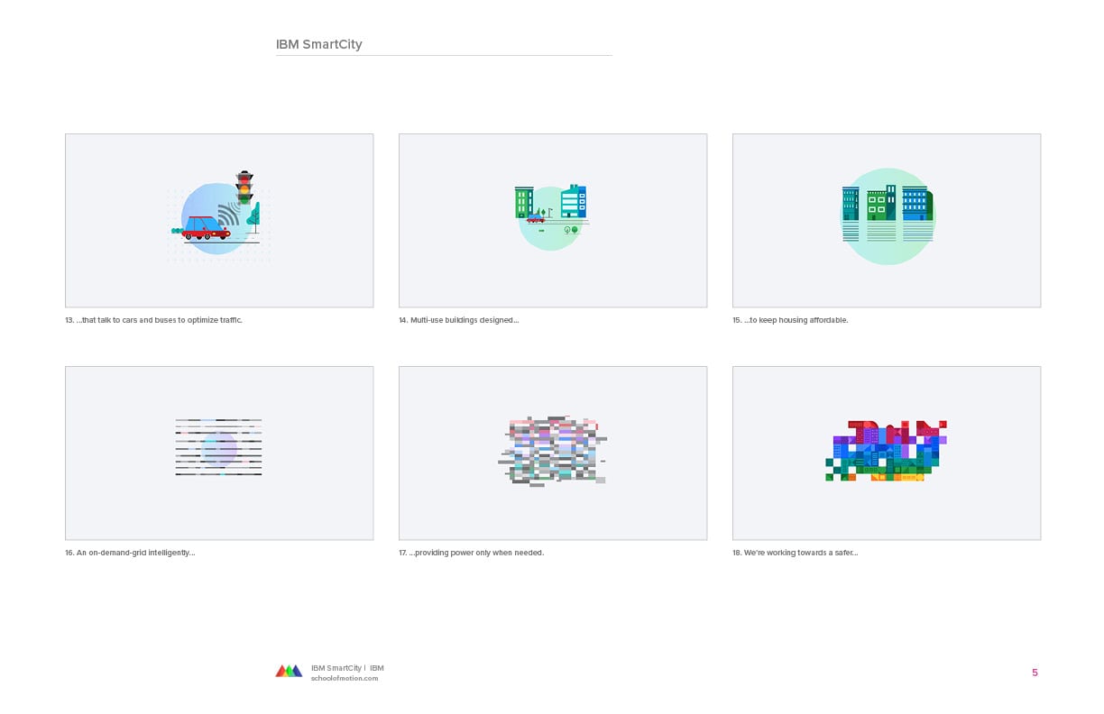
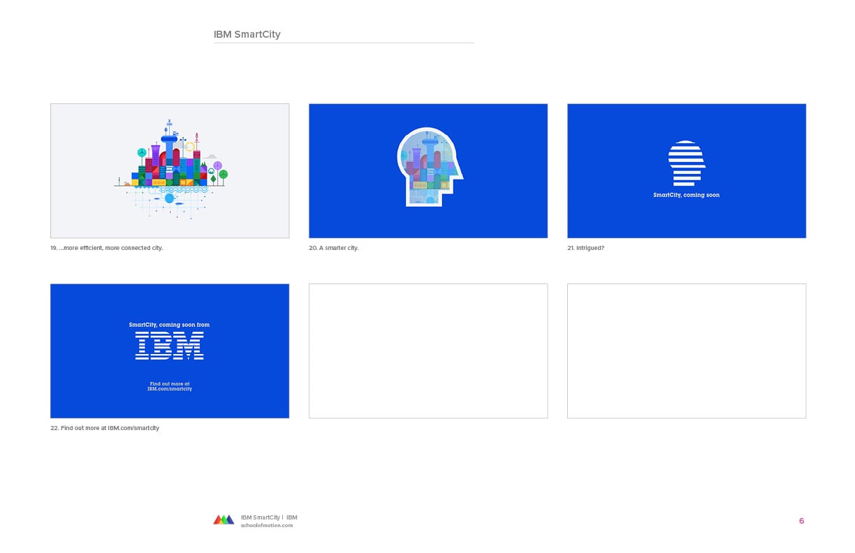
IBM SmartCity
I created style frames for a 30-second IBM SmartCity concept spot, using artwork by Brian Gossett as the foundation. The story touched bigger ideas like lower traffic, better housing, and reduced energy costs.
My part was shaping those themes into something visually coherent and easy to read in a short amount of time.
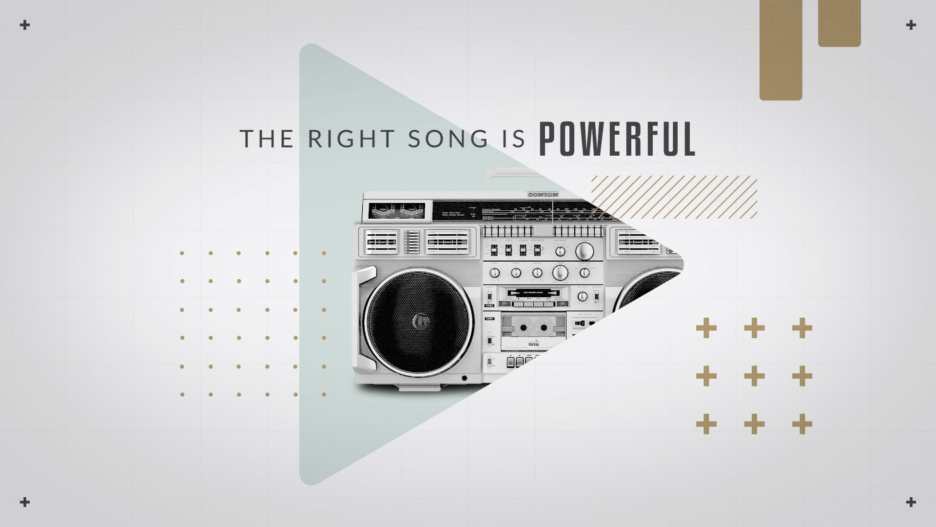
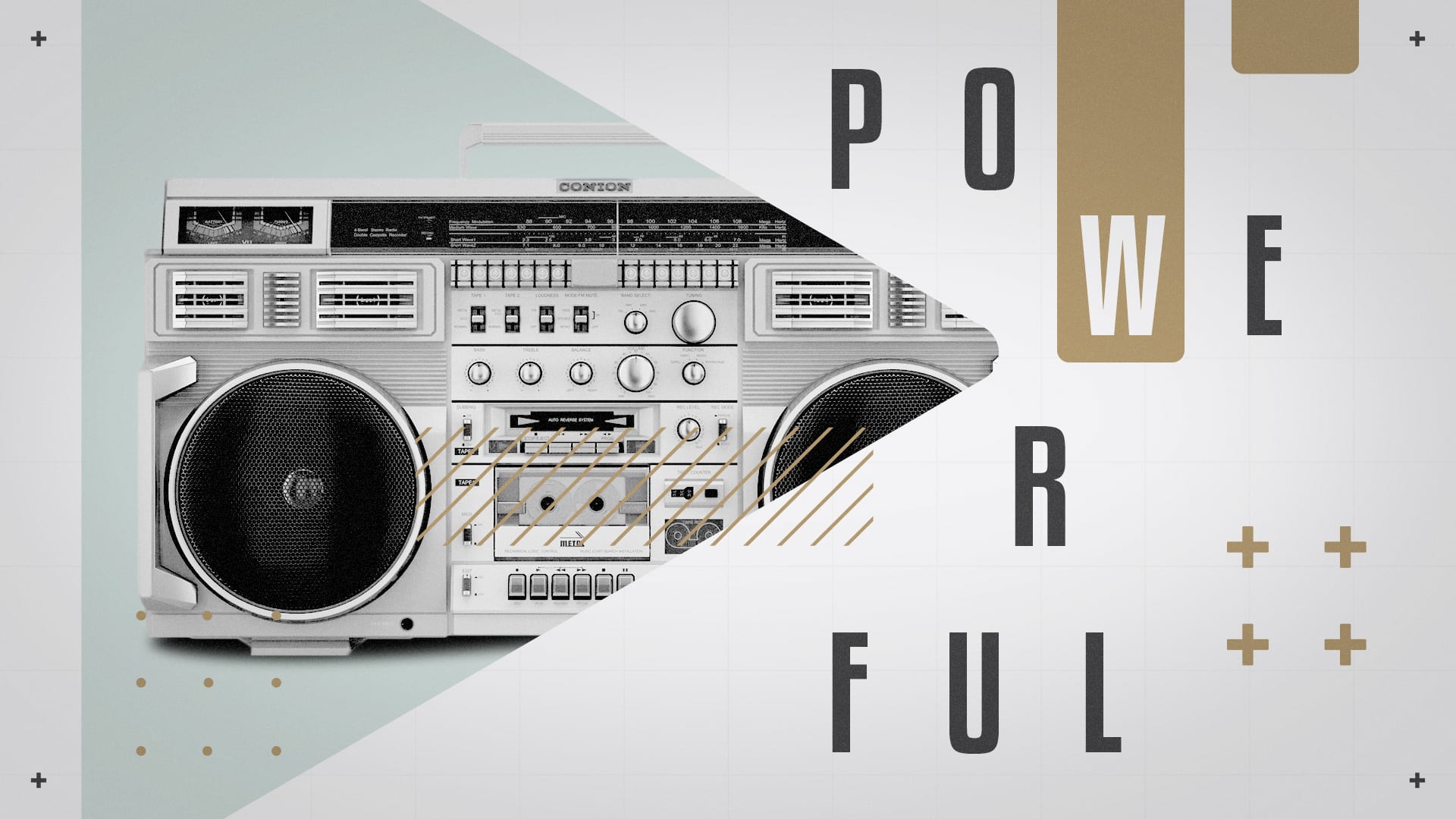


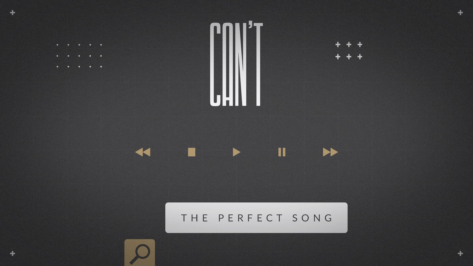
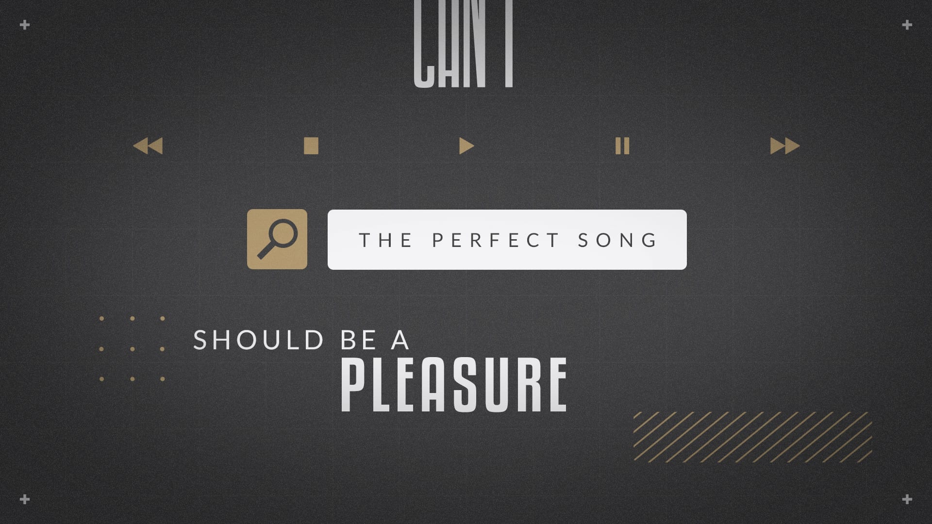
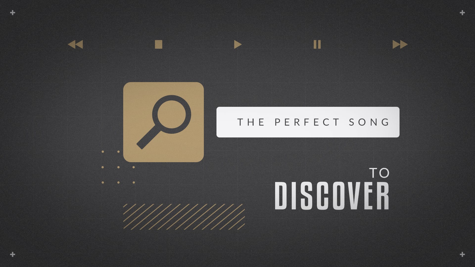


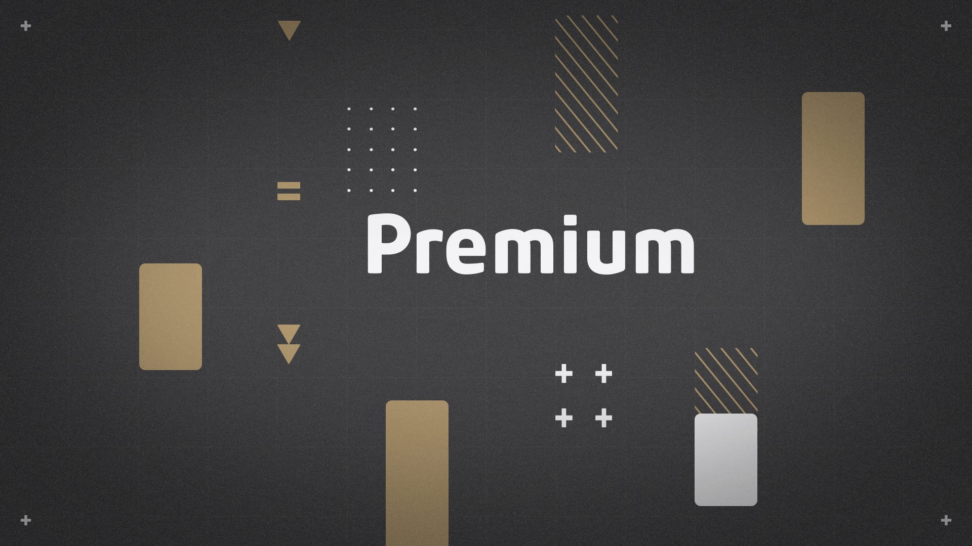
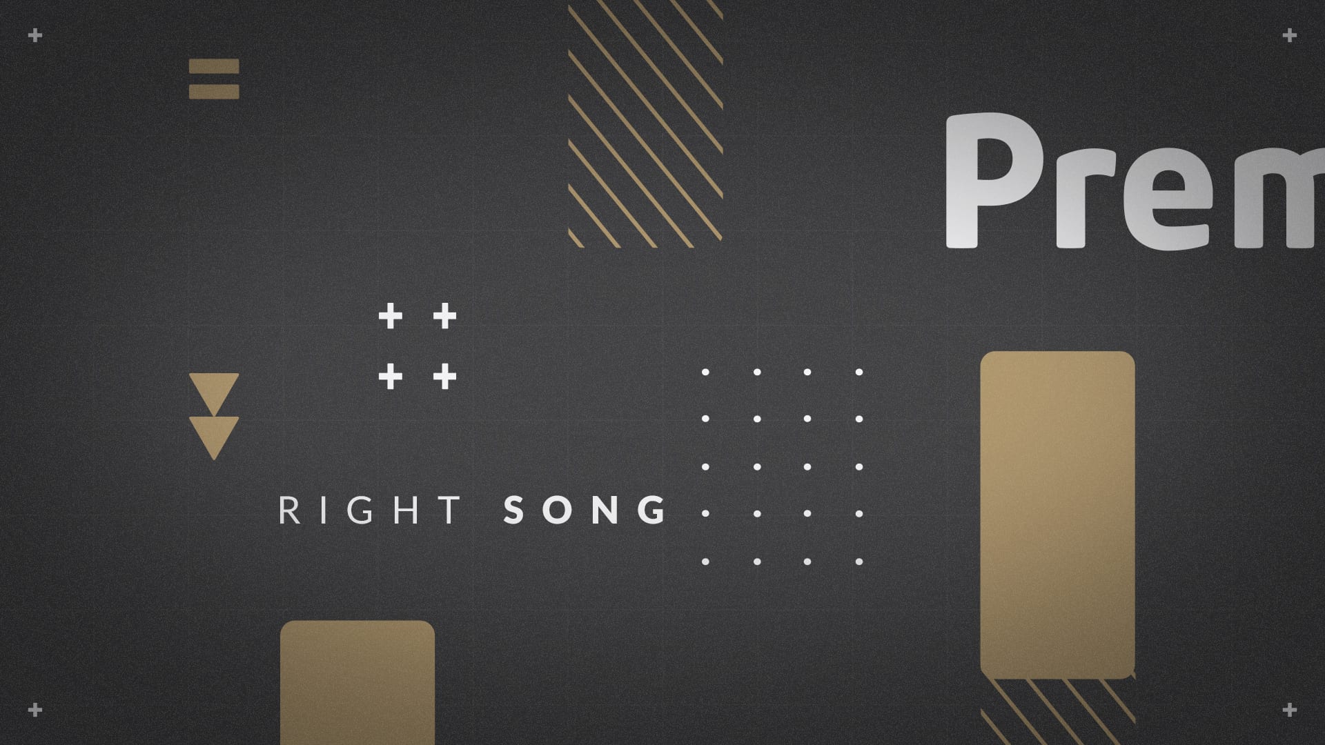
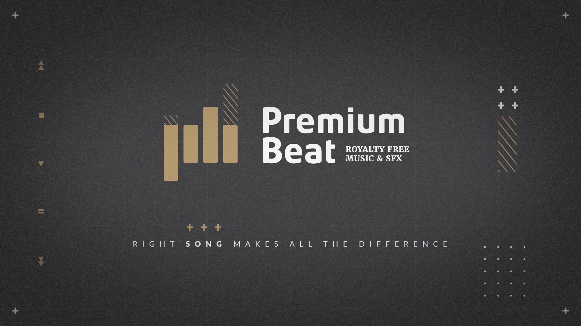
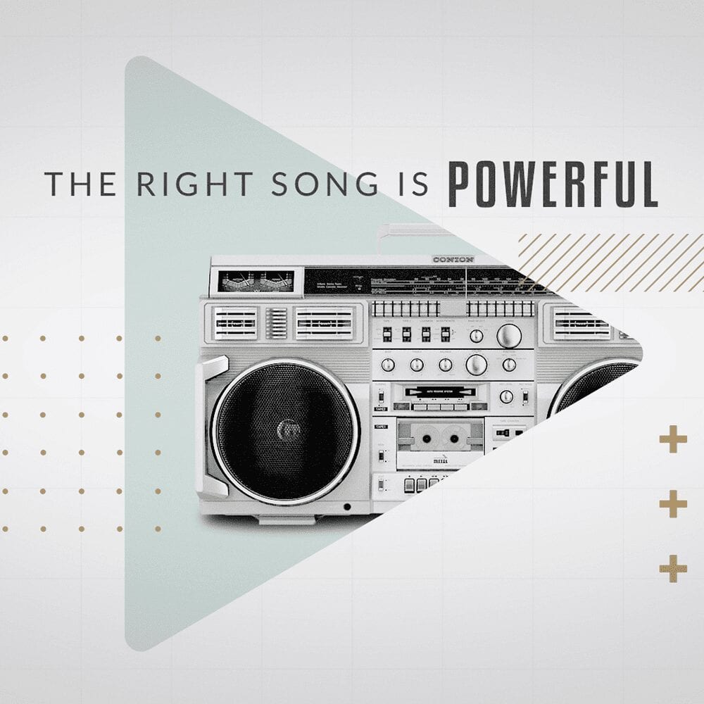
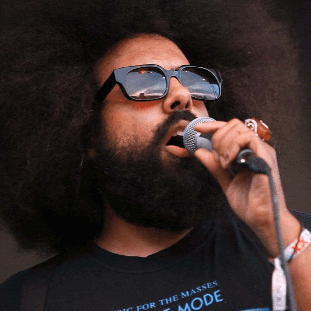
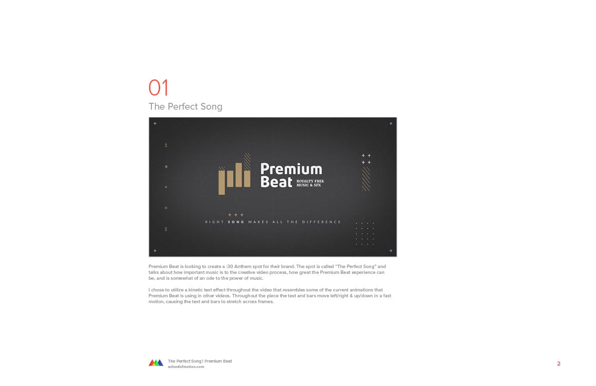
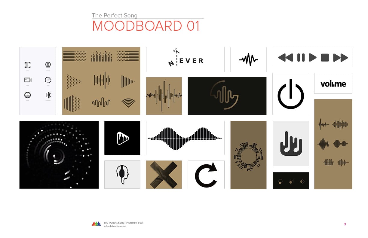
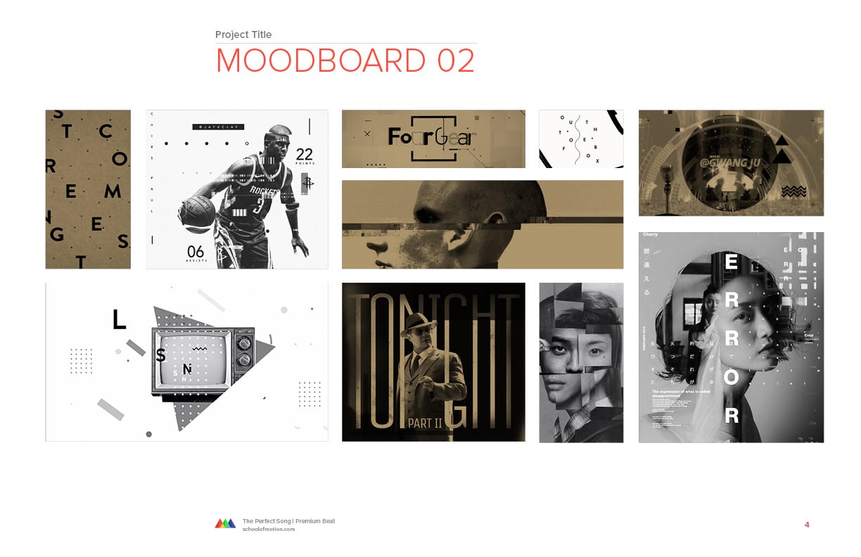
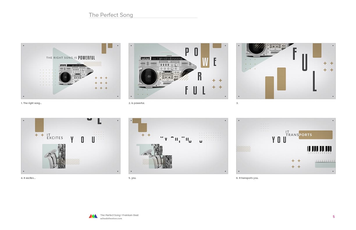
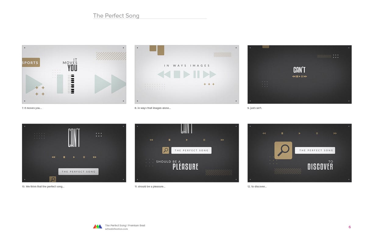
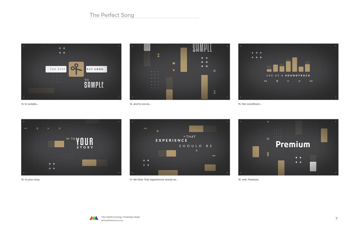
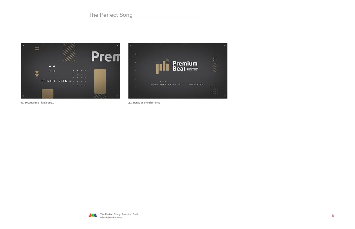
The Perfect Song - Premium Beat
This was a 30-second anthem spot for Premium Beat, built around the role music plays in the creative process. I boarded out all of the frames to show how the piece could build emotion and momentum through the idea of sound.
The challenge was making something about music feel cinematic without leaning on obvious visual shortcuts.
Art - Patrick Flaherty
Selected Works