Post-Production Supervisor & Animator
From 2018 to 2020, I worked with the Microsoft Brand team on a series of motion explorations meant to stretch how Microsoft could show up in video without losing the core identity. The goal was not to throw the system out. It was to see how far we could push it and still have it feel unmistakably Microsoft.
The examples below are some of the tests I led with my motion graphics team. Some stayed as explorations. Others turned into techniques we used in real projects.
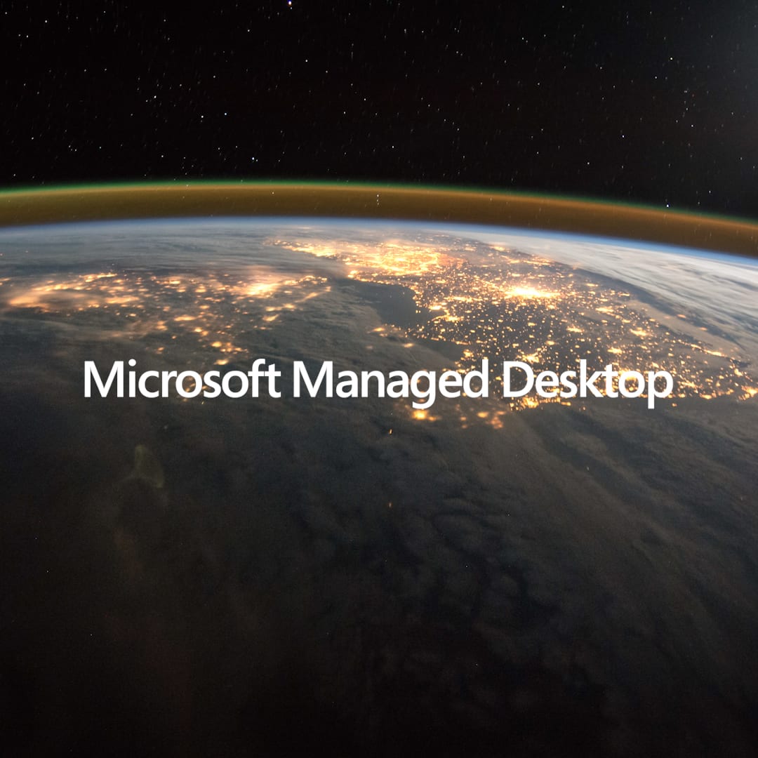
Microsoft
Common Intro
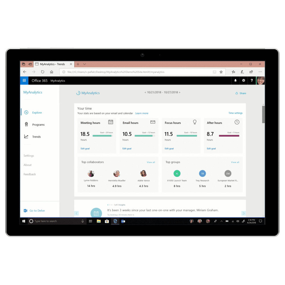
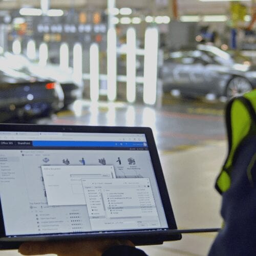
When I started at Microsoft, most videos used the same intro and outro. It worked, but over time more teams wanted variations, either to fit a different tone or to get to the customer story faster.
That led us to explore ways of bending the standard package without losing the brand. In some cases, we skipped the usual text intro entirely and opened straight on the story.
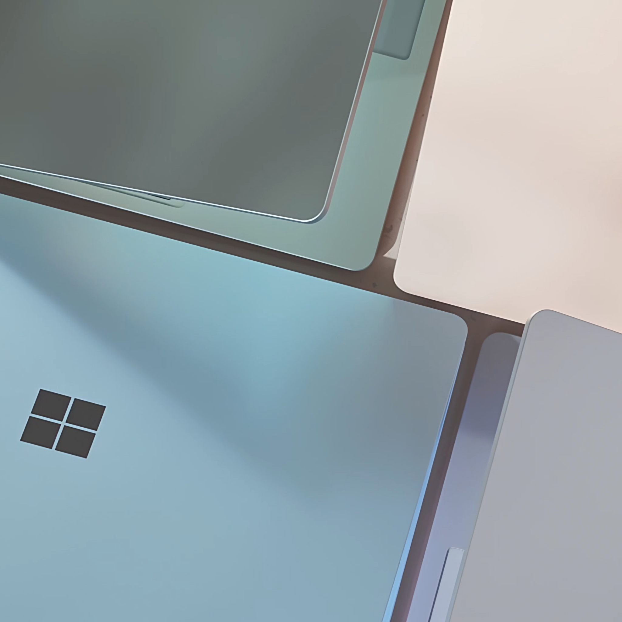
Manipulated Logo Animation
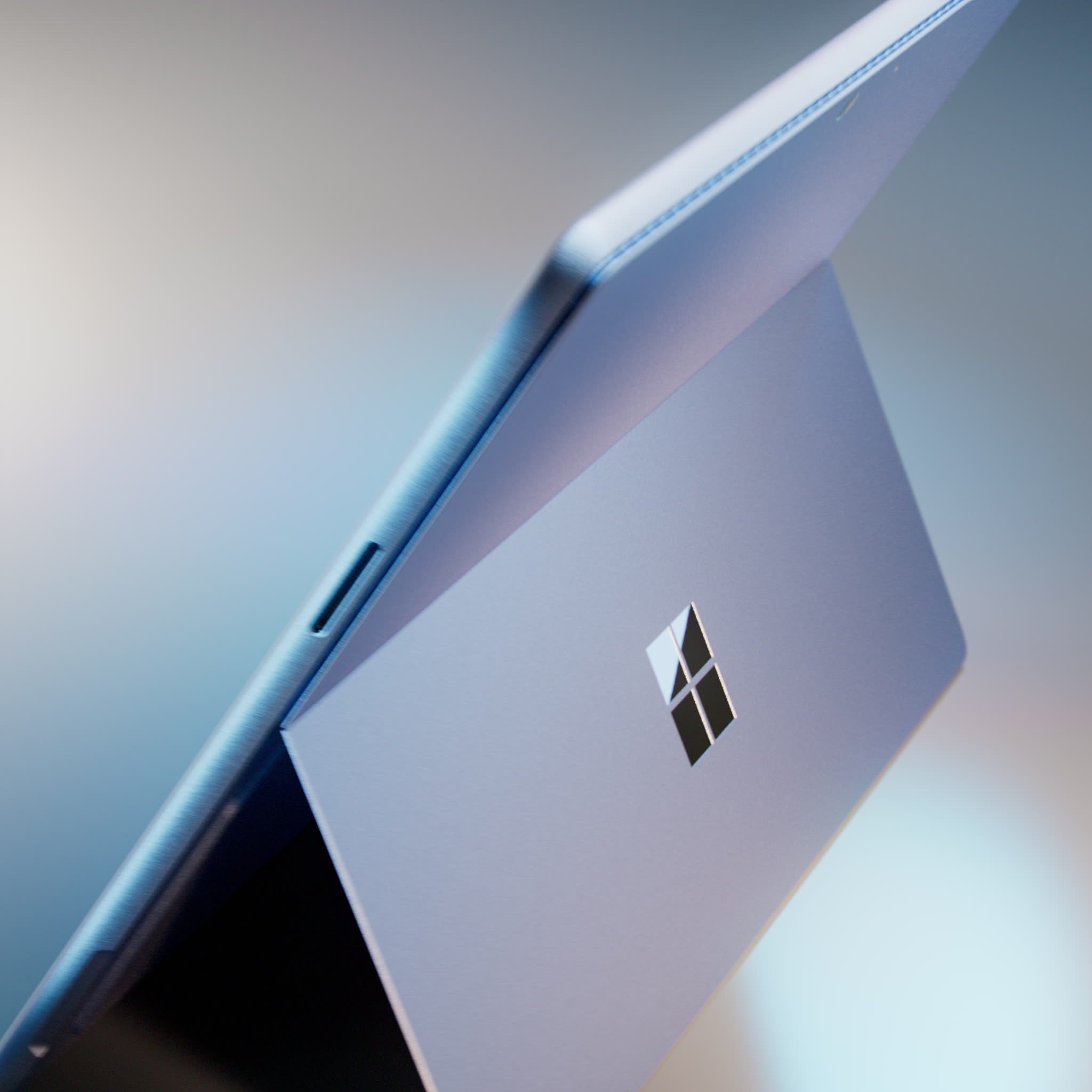
One of the first places we started experimenting was the Microsoft logo itself. I began testing alternate ways of bringing it on and off screen, especially while working with the Microsoft 365 team.
Those early studies helped us think a little more loosely about brand motion and opened the door to a wider set of transitions.
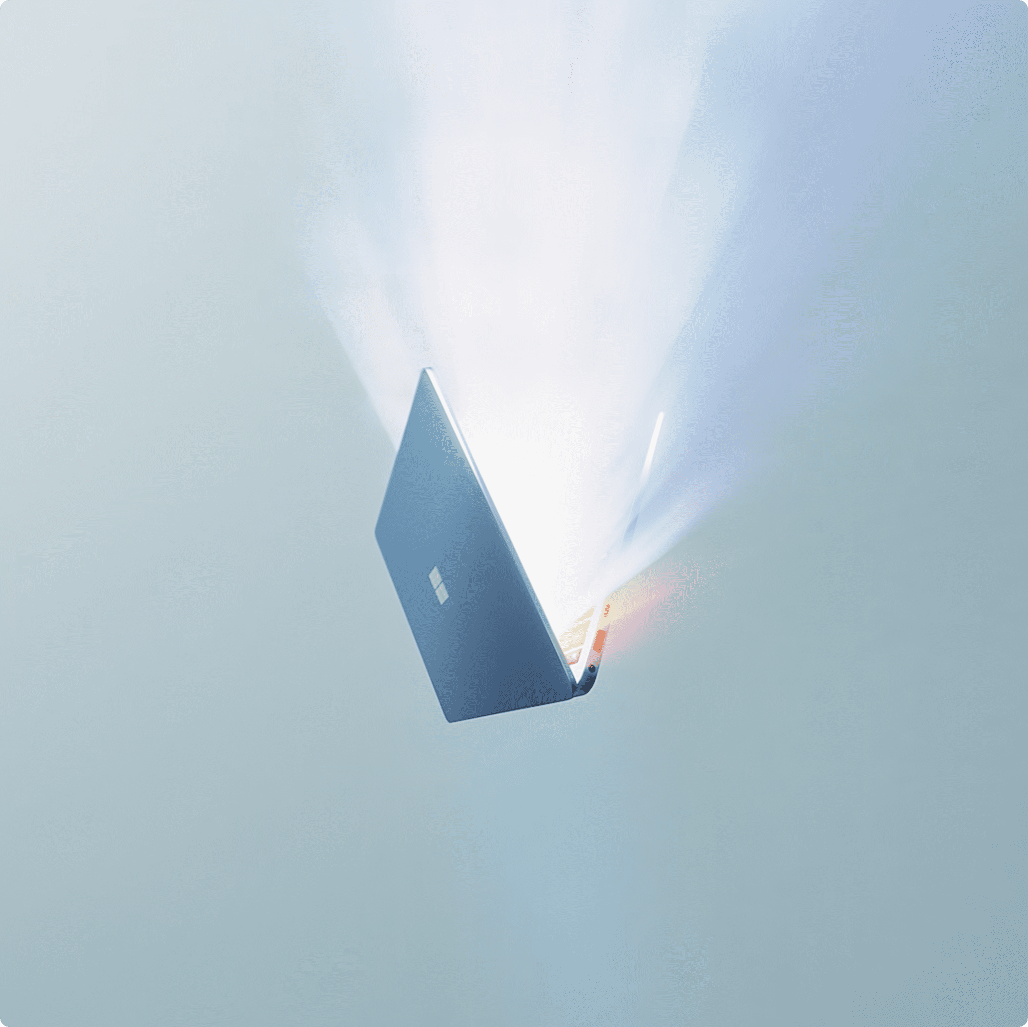
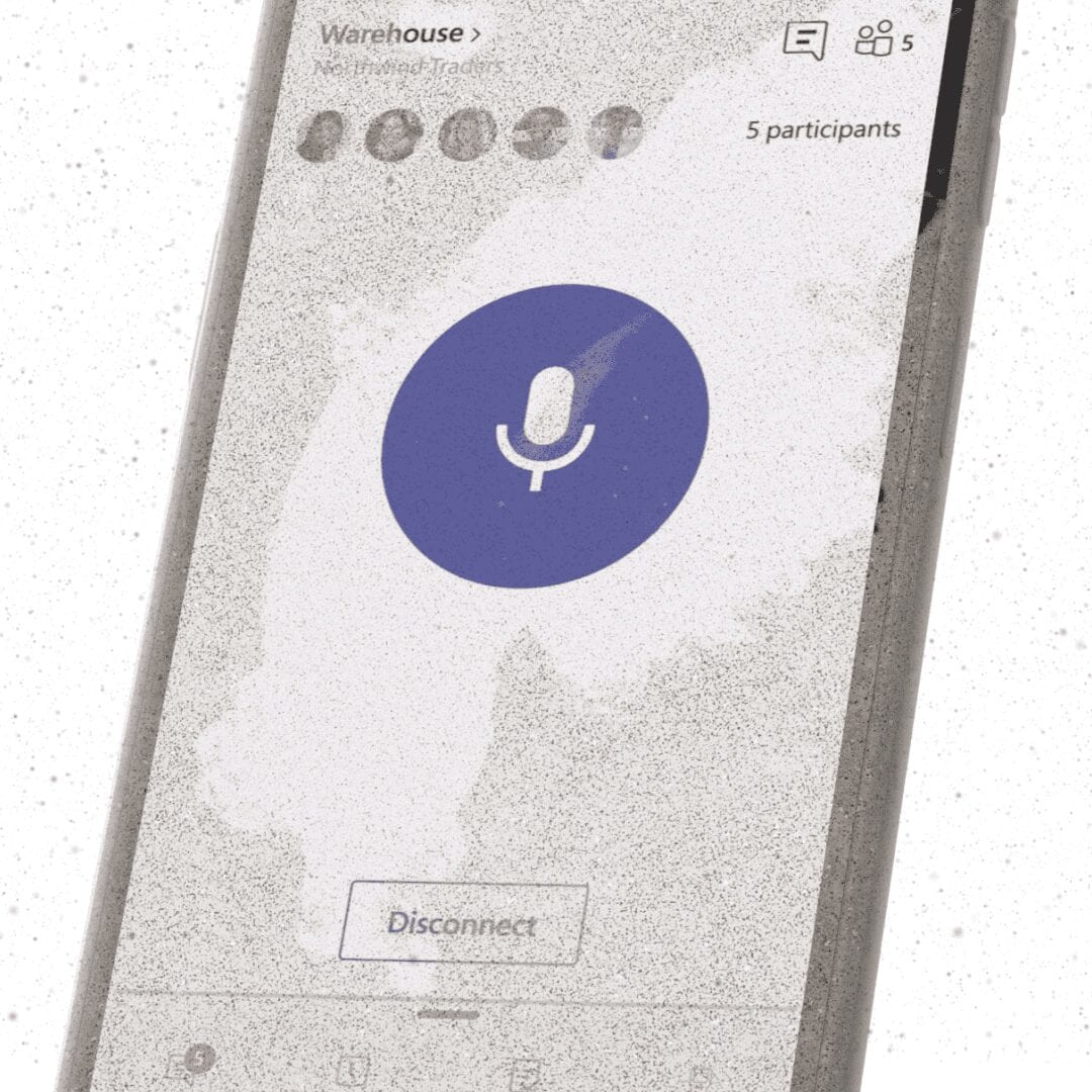
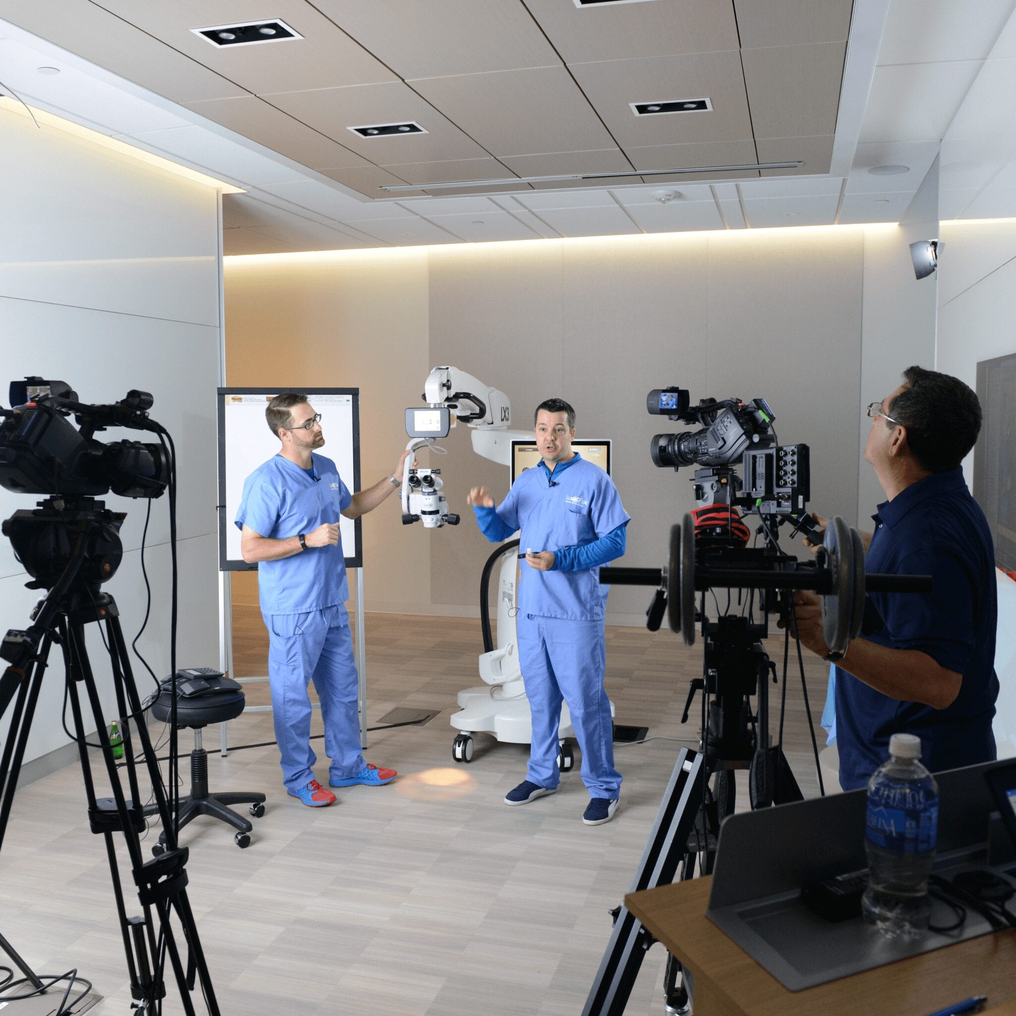
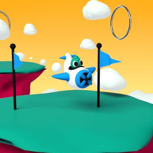
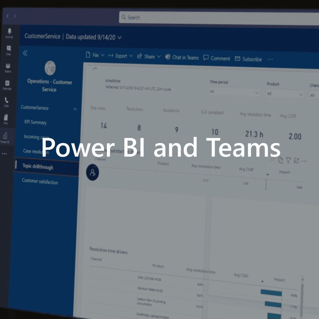
Zoom Transitions & 3D Objects
Another option we explored was a fast zoom transition that blurred the footage at peak speed. That created a kind of rack-focus feeling as the video moved from the Microsoft logo into live action.
We also started testing 3D objects at the beginning of the video, which gave the open a different kind of weight and a little more dimensionality.
Updated Color Wipe
The three-color wipe showed up in almost everything, so naturally we started asking how far it could be pushed. One direction was a mock 3D version that still moved quickly and could be built efficiently in After Effects.
It kept the spirit of the original transition, but gave it a little more depth and variation.
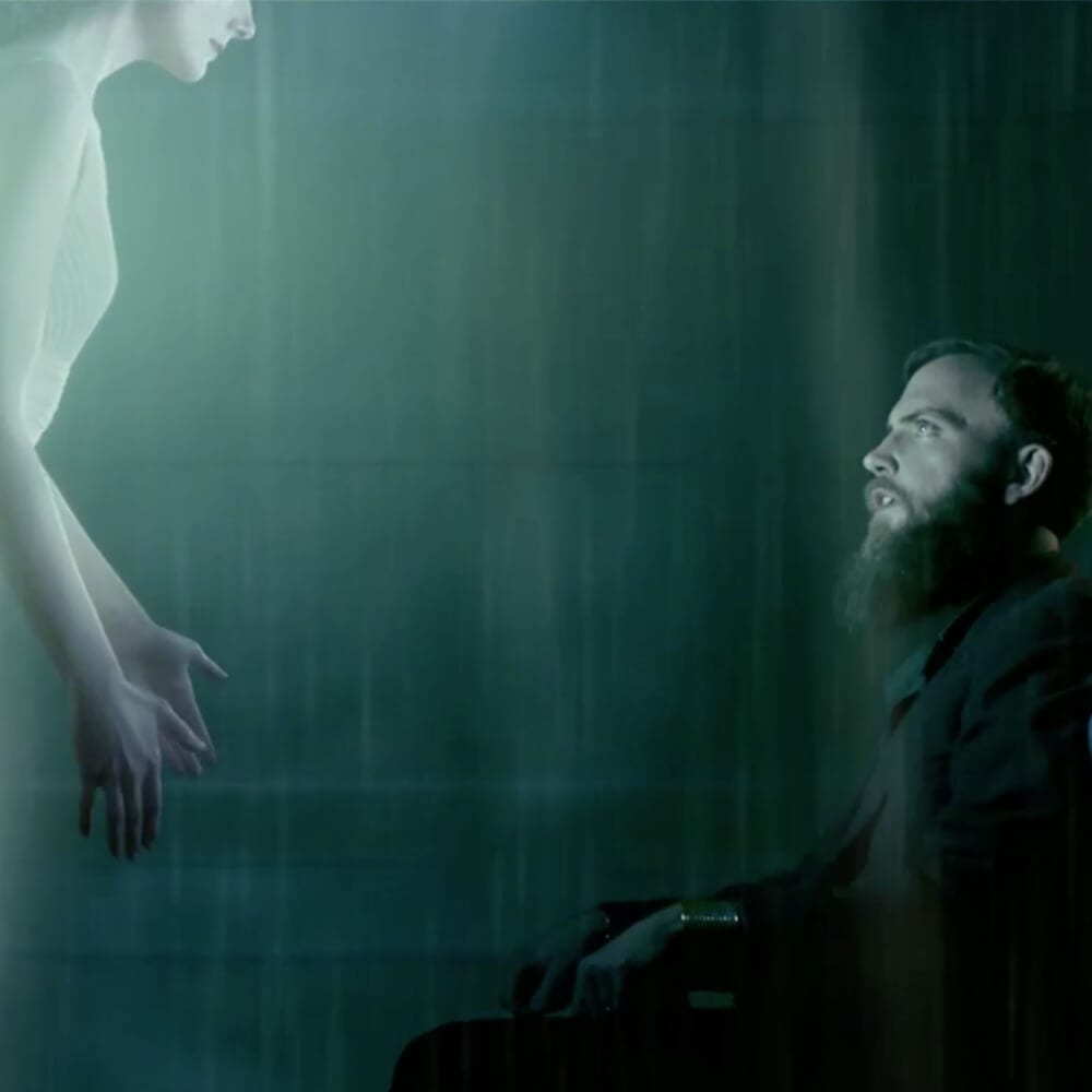
Rotoscoping
From there, we pushed further by using filmed talent to wipe the Microsoft logo on and off. It was a simple idea, but it gave the branding a more human feel and made the transition feel tied to the footage instead of pasted on top.
That approach ended up being one of the more enjoyable ones to explore, and we carried it into several projects.
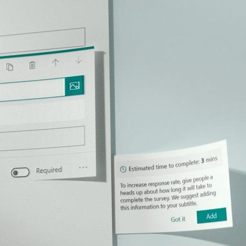
Text Animations
A big part of leading the motion team was setting best practices for how text should move inside Microsoft videos. I spent a lot of time shaping that direction, especially for sizzles and social pieces where the motion needed to feel fast but still on-brand.
This example shows some of the text animation approaches I shared with the team and used as a baseline moving forward.
Animation - Thomas Nichols
Post-production Supervisor & Animation - Patrick Flaherty
Selected Works